PPT and DOC templates for Itransition
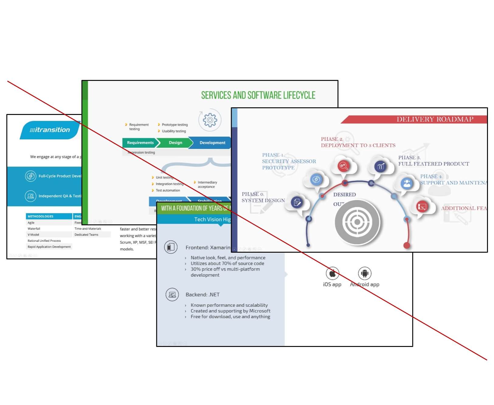
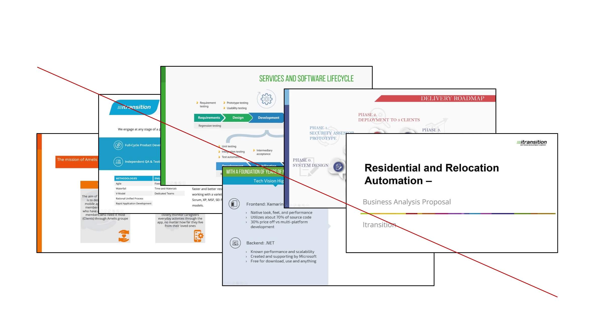
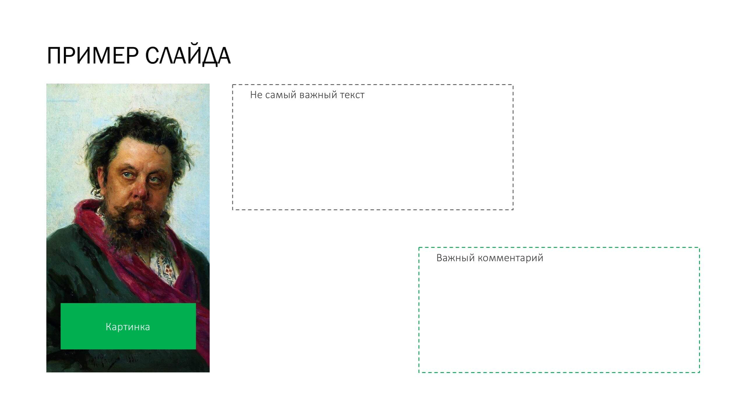
At Itransition existed no presentation design templates. Clients have been receiving patchy sales materials, while sales-people, managers, and marketing specialists were unable to share their best practises—one would need to redesign a slide from scratch to put it in a presentation.
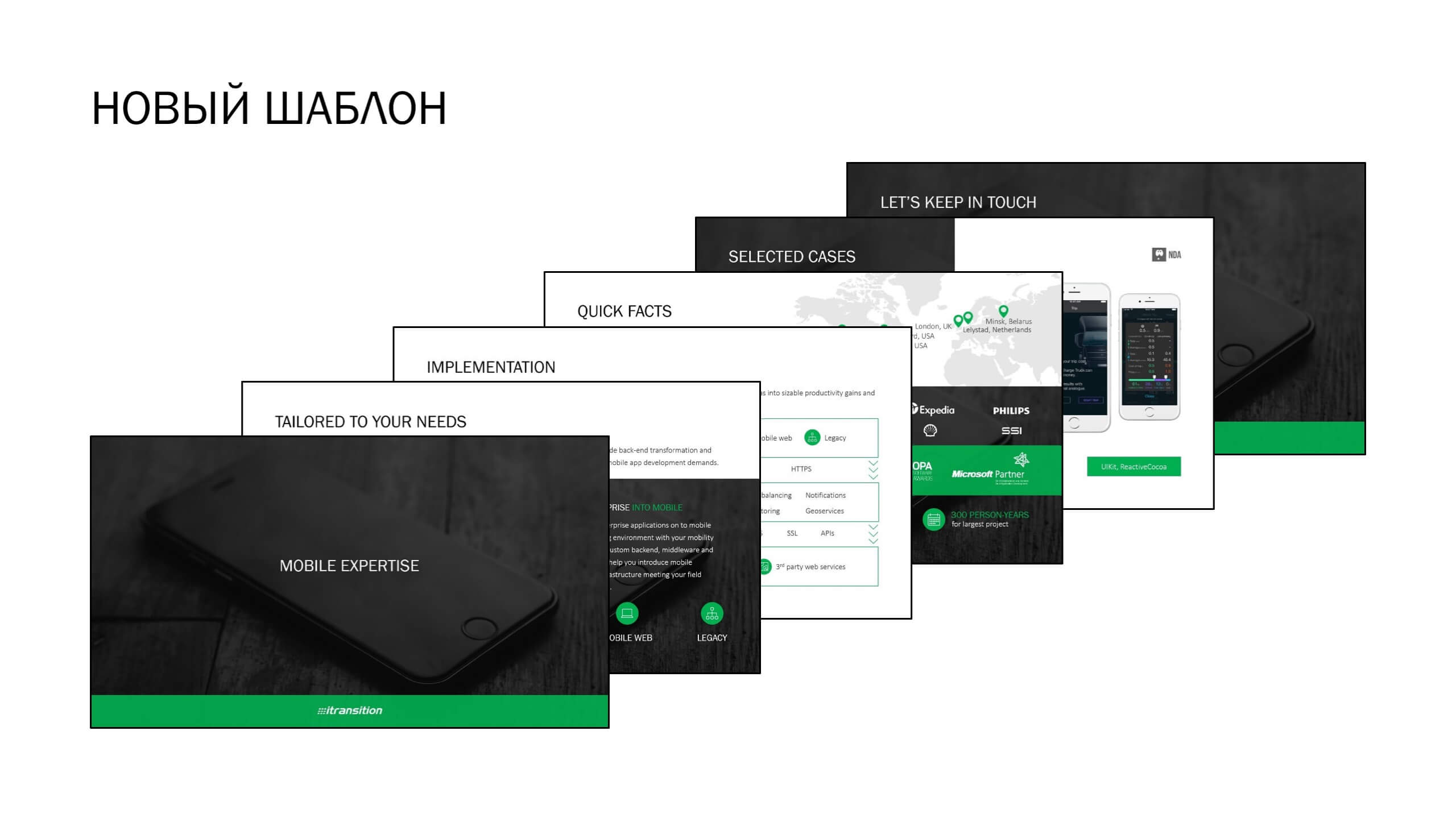
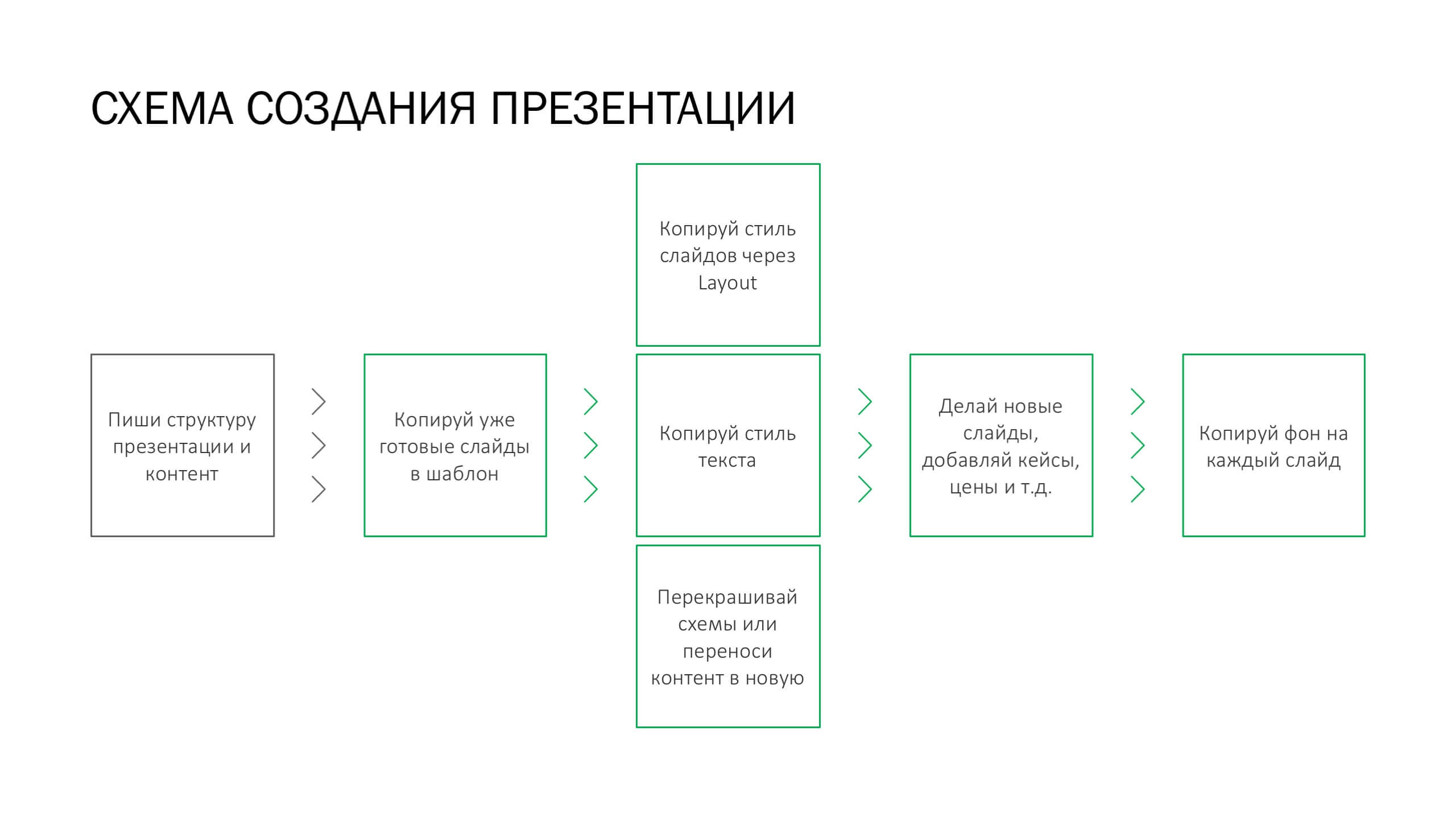
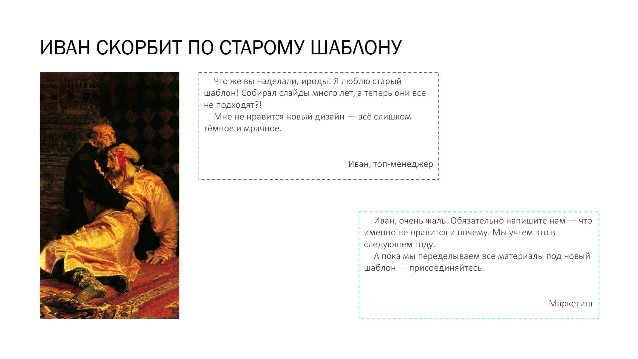
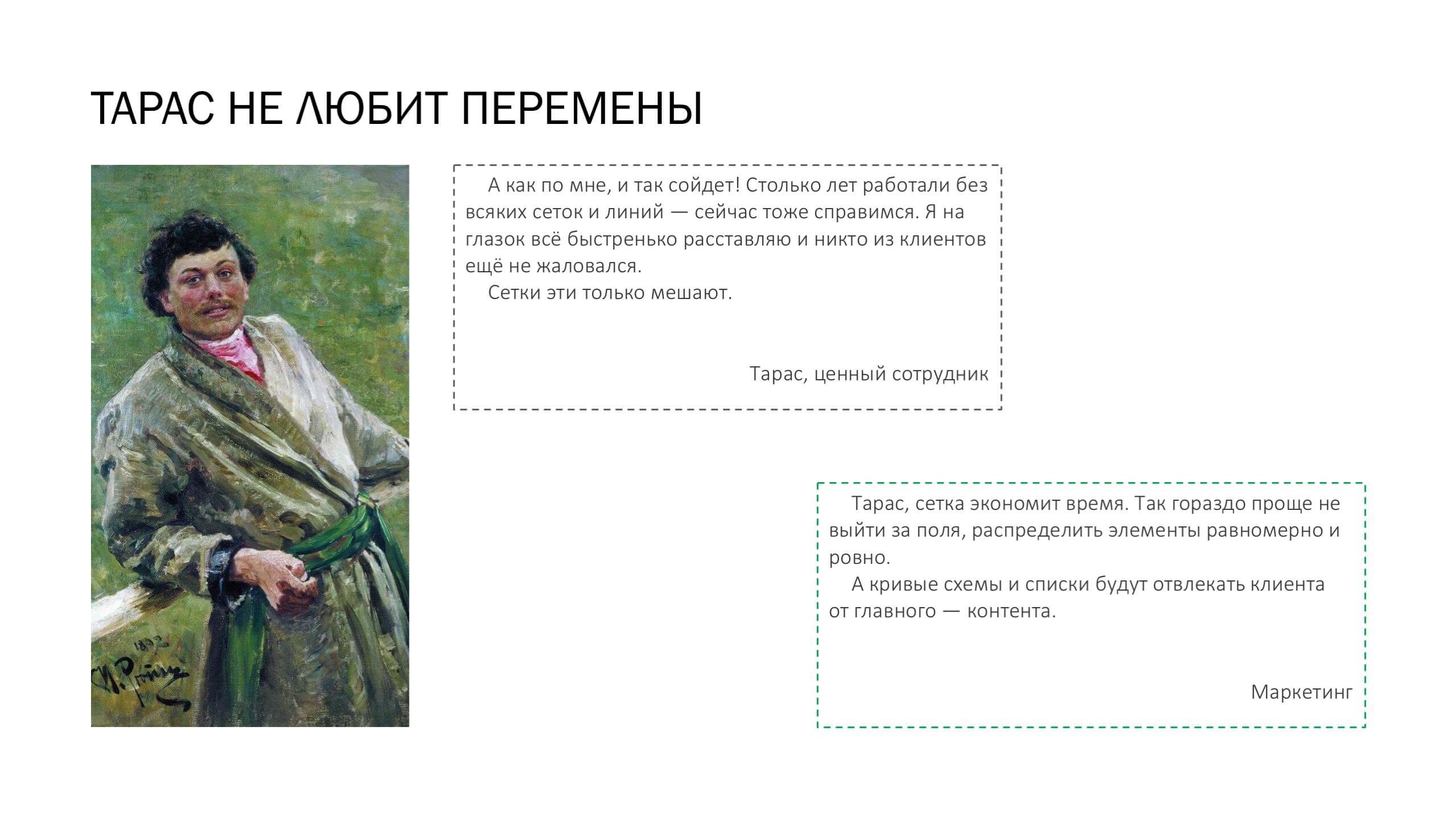
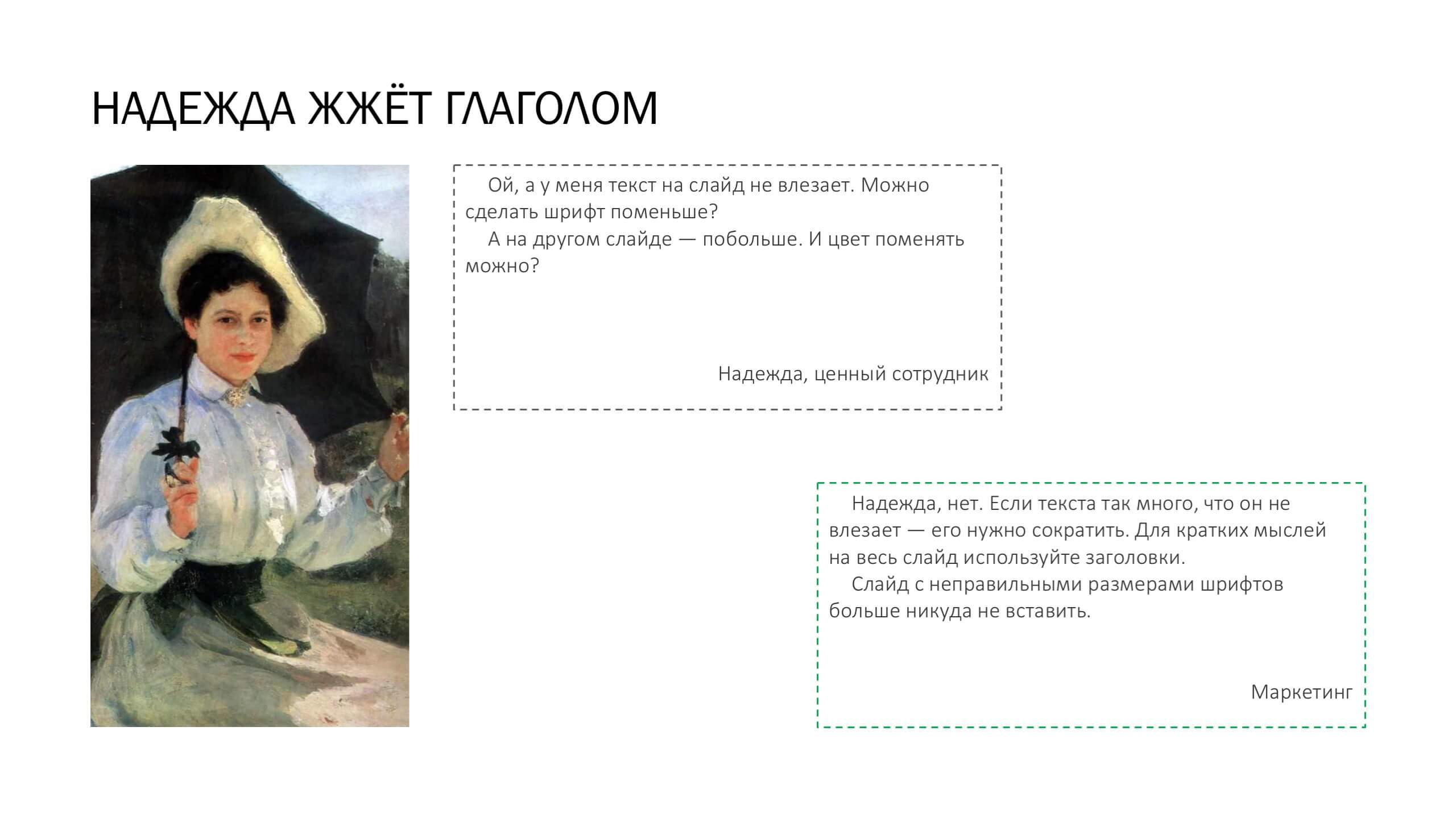
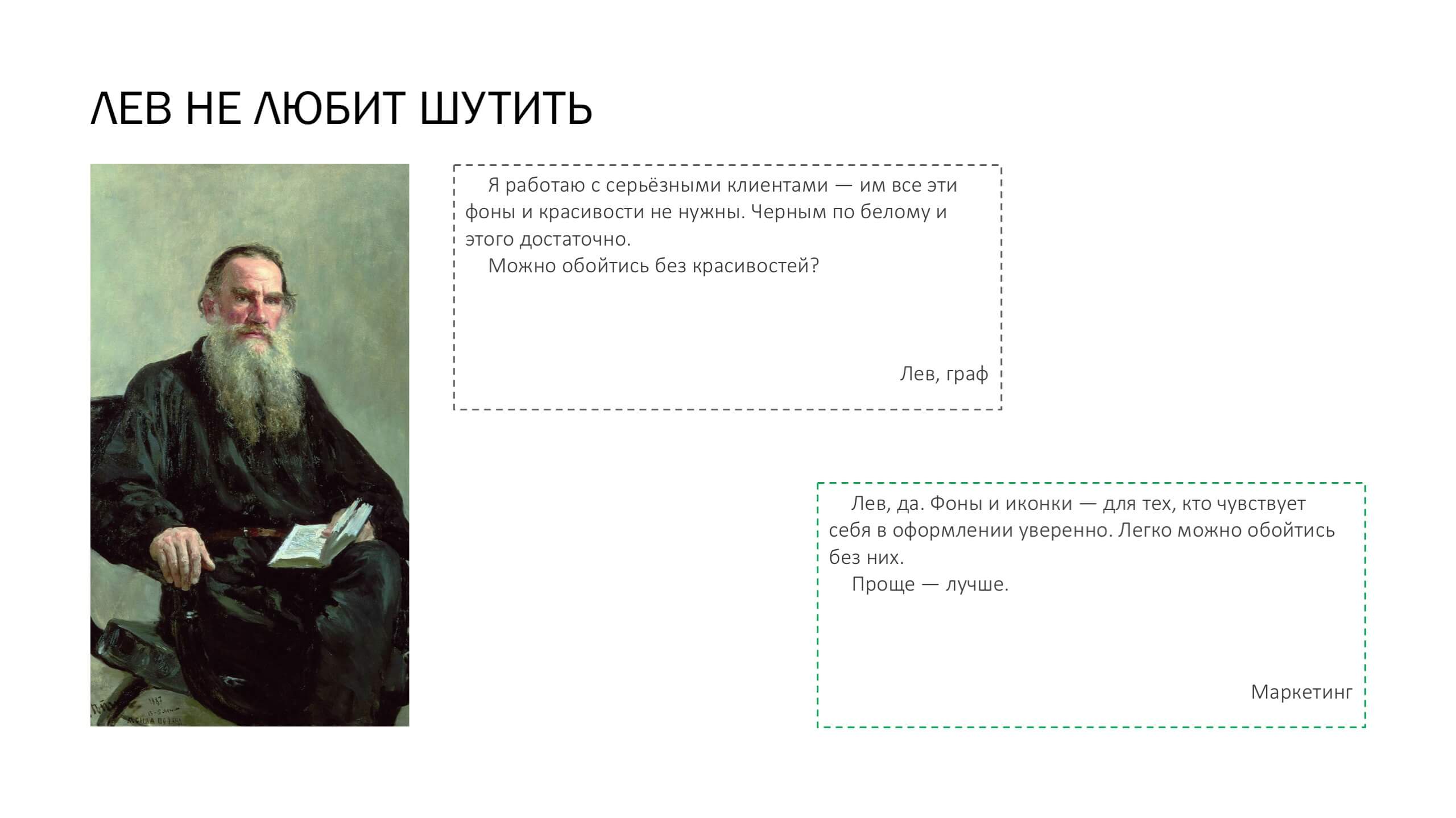
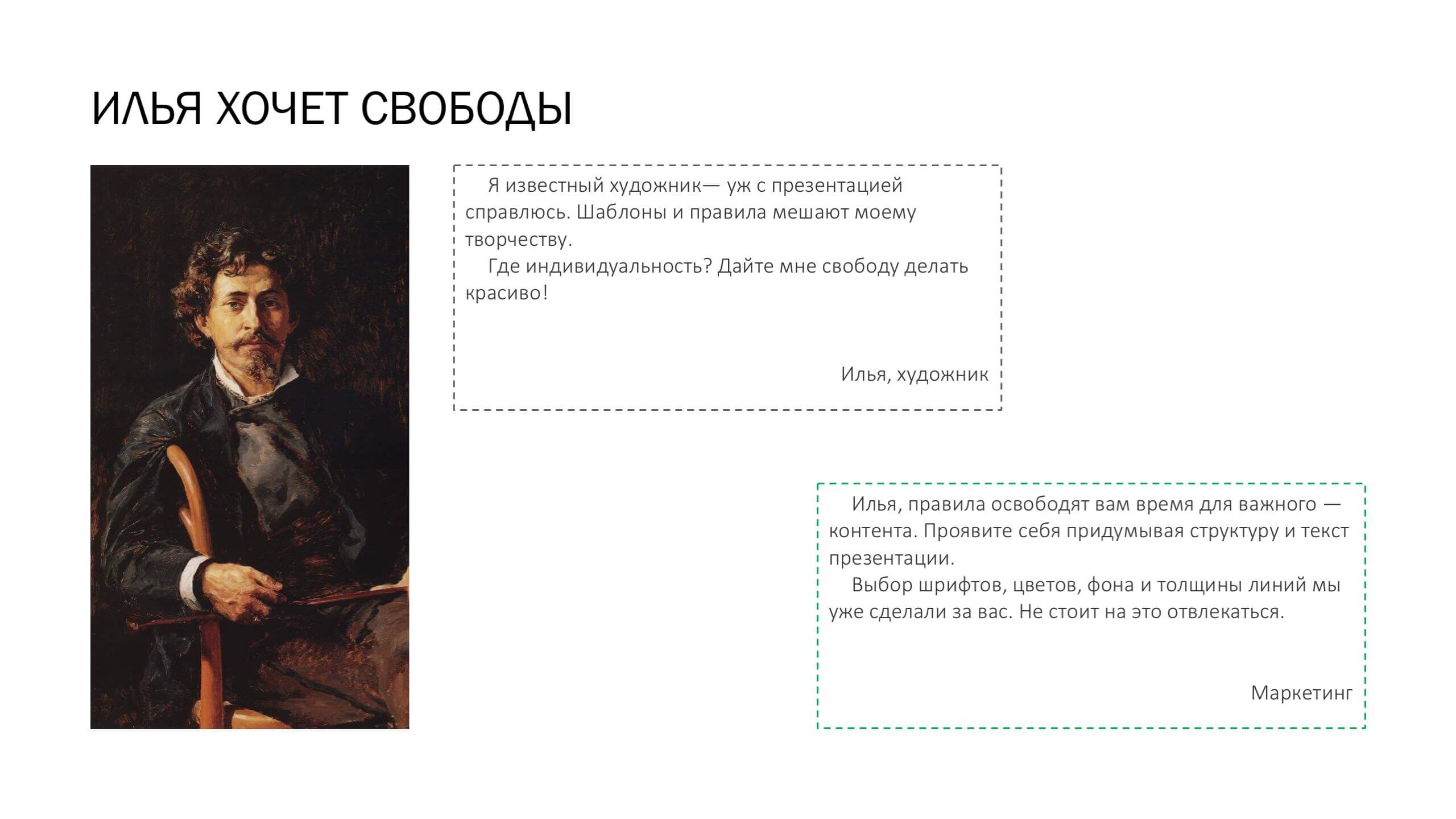
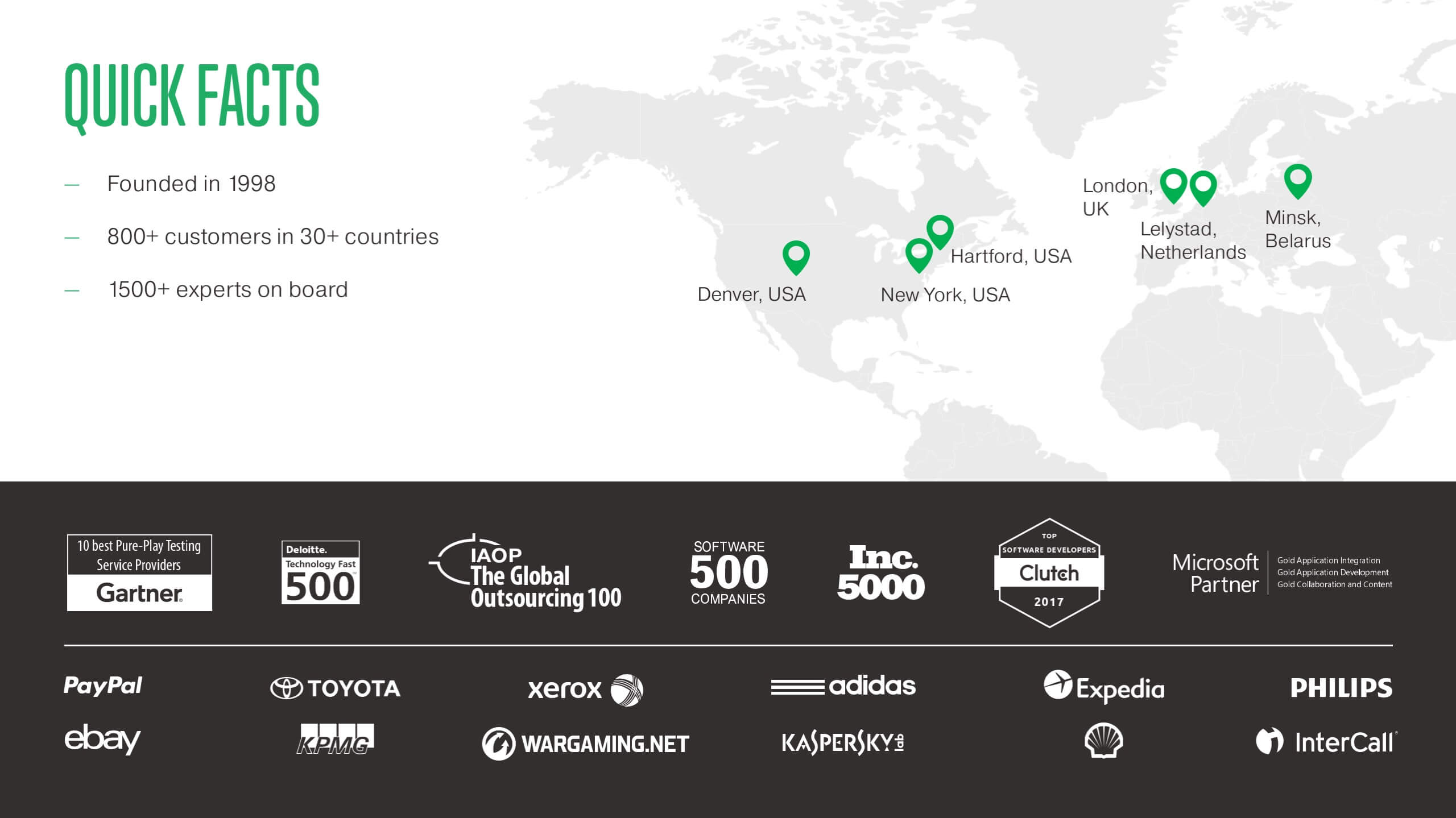
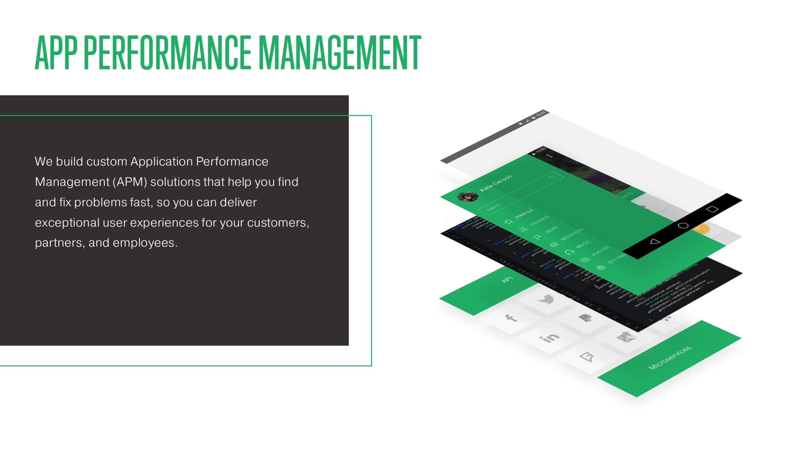
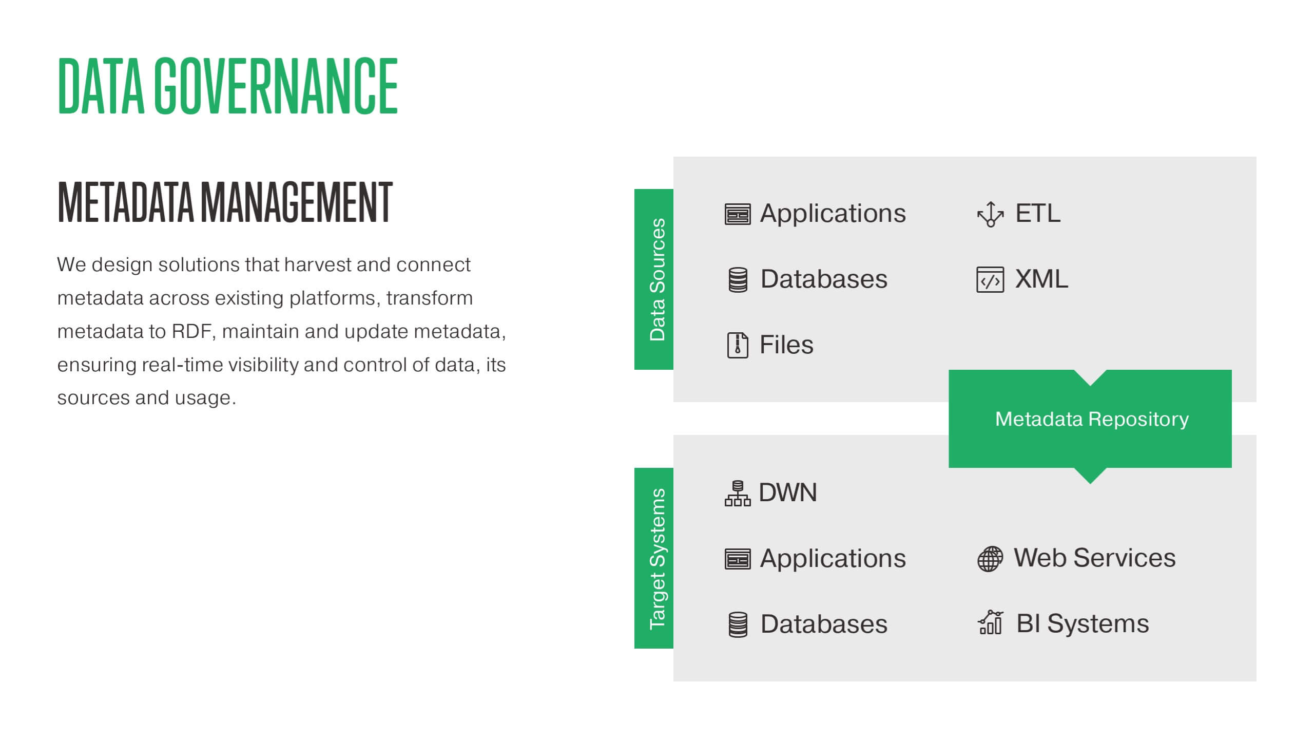
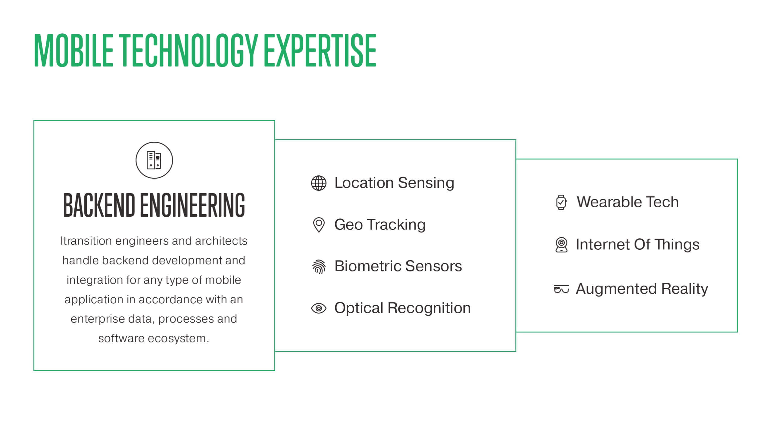
This is why in 2016 we developed a uniform template for presentations within Itransition marketing team. To ‘sell’ the idea of the template, I conducted a series of workshops for colleagues from other departments. I presented the idea and taught core design principles—so sales, pre-sales, managers, and everyone else could start creating beautiful presentations right away.
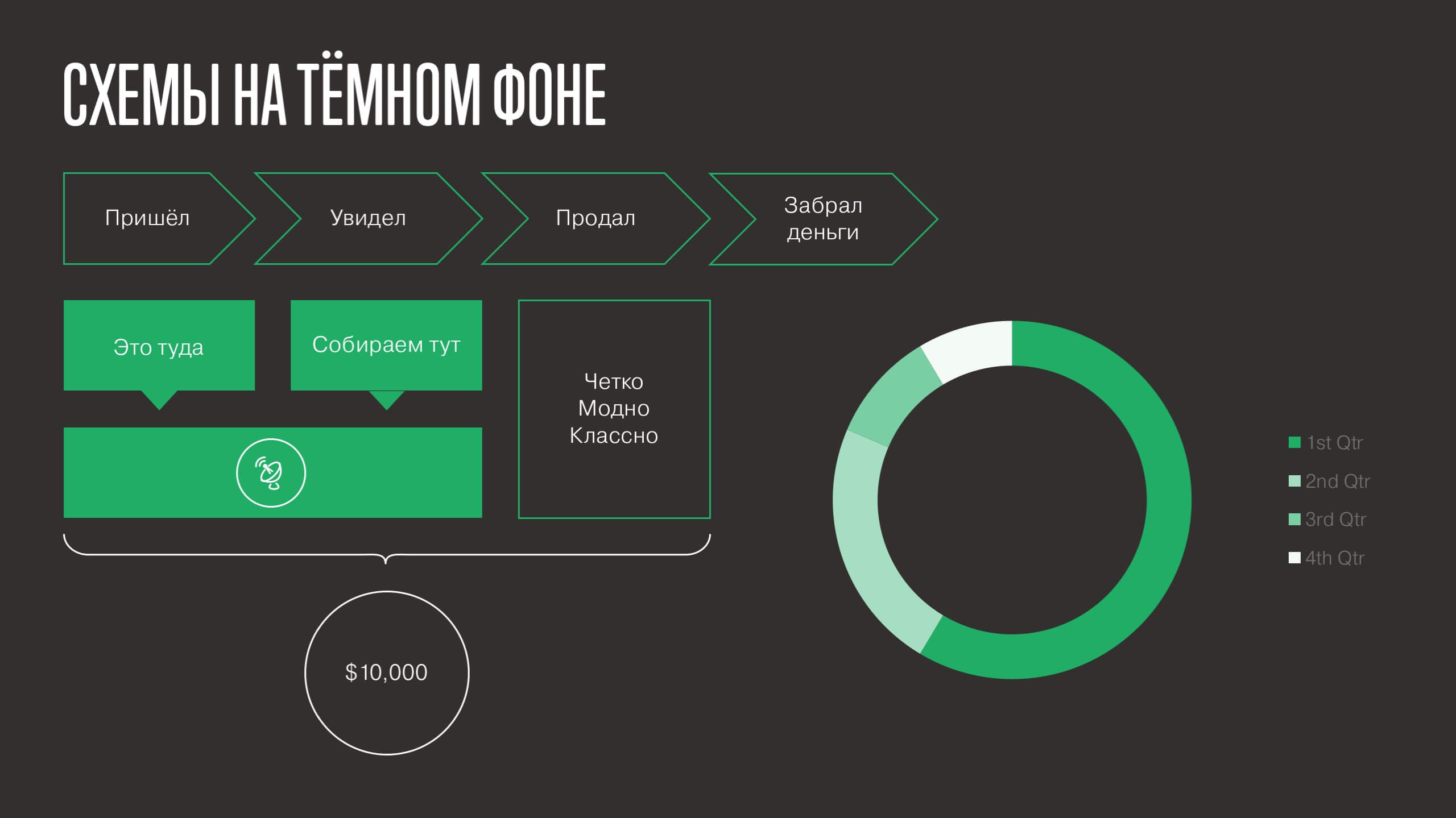
New design
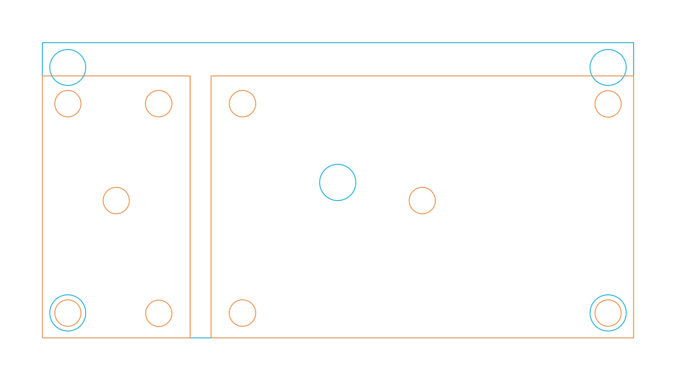
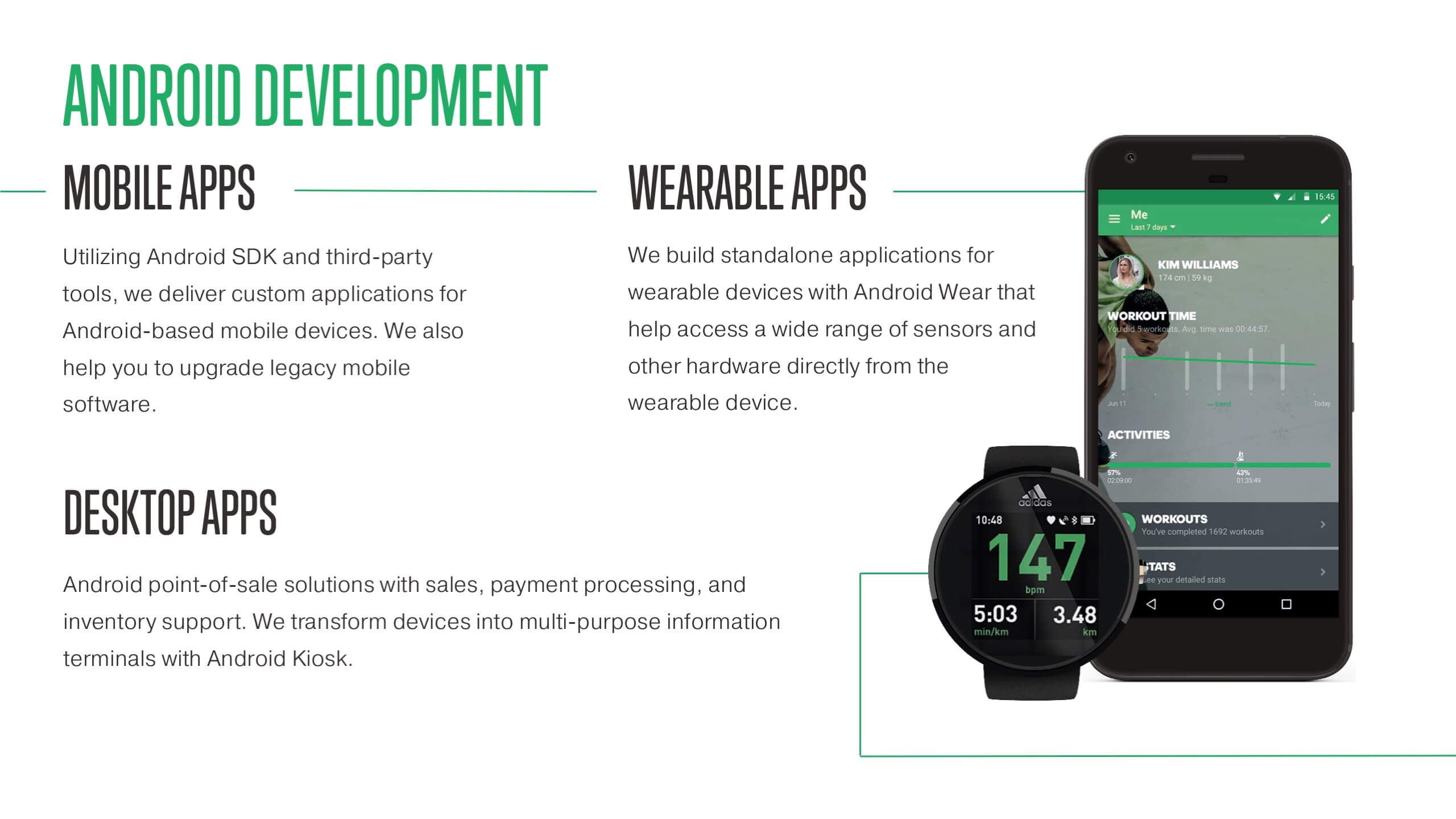
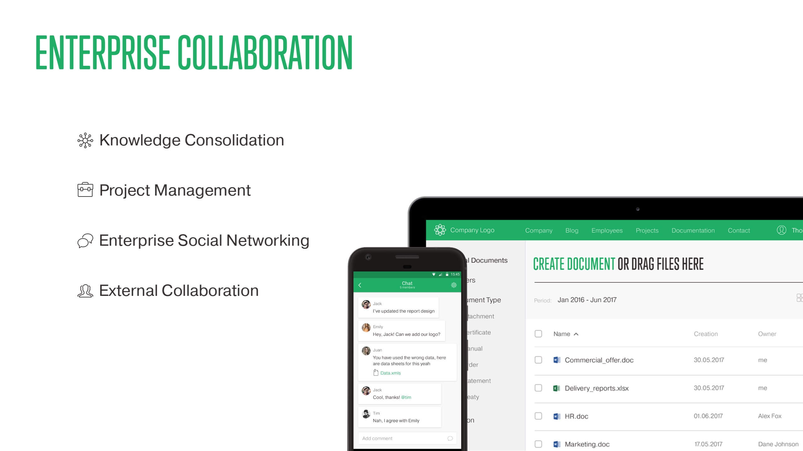
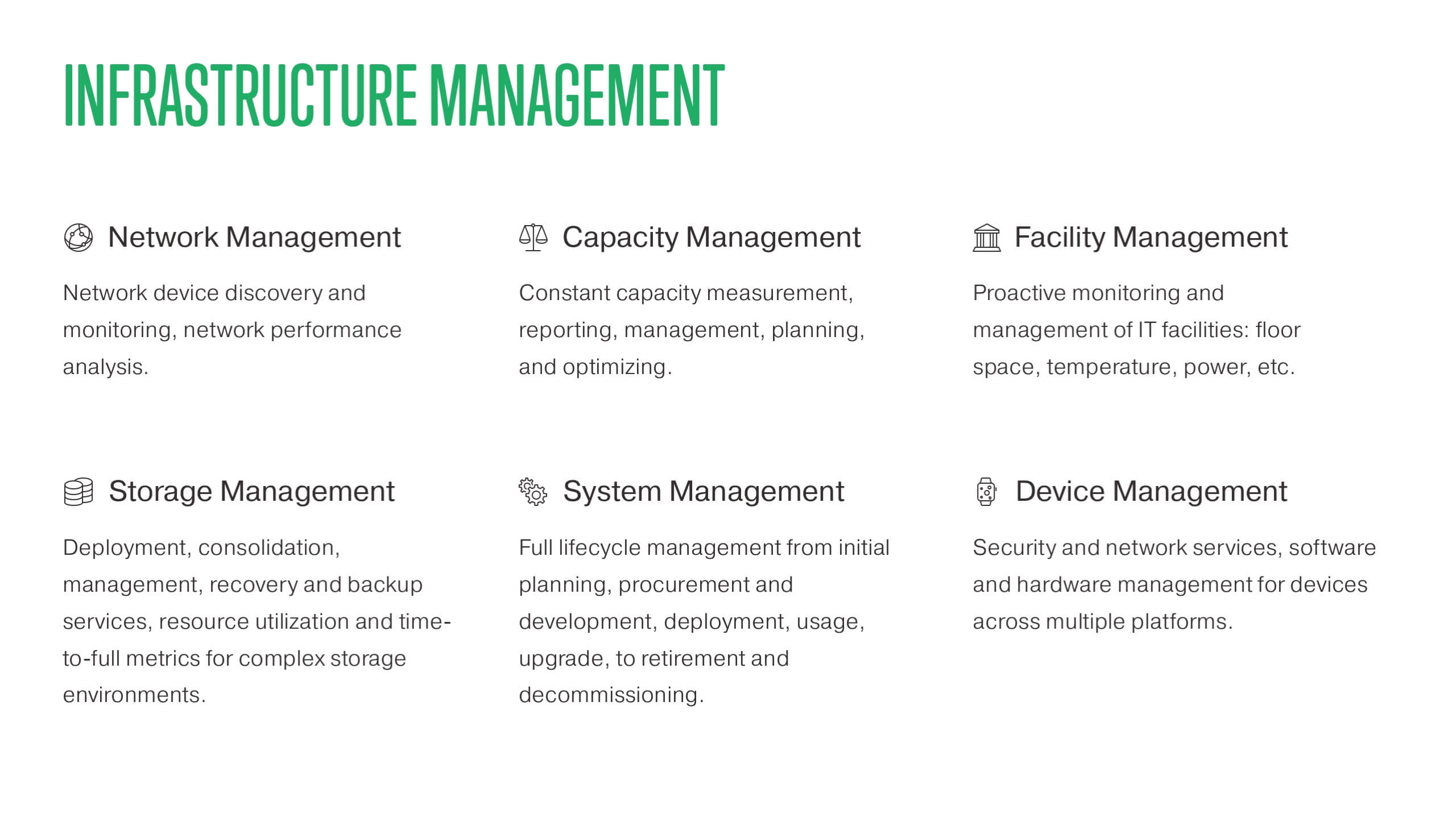
In 2017 itransition.com design has been updated—based on the new guidelines I’ve updated the templates as well. This time I’ve increased complexity and added a number of details: 12-column grid, secondary and tertiary colors, new icons, etc.
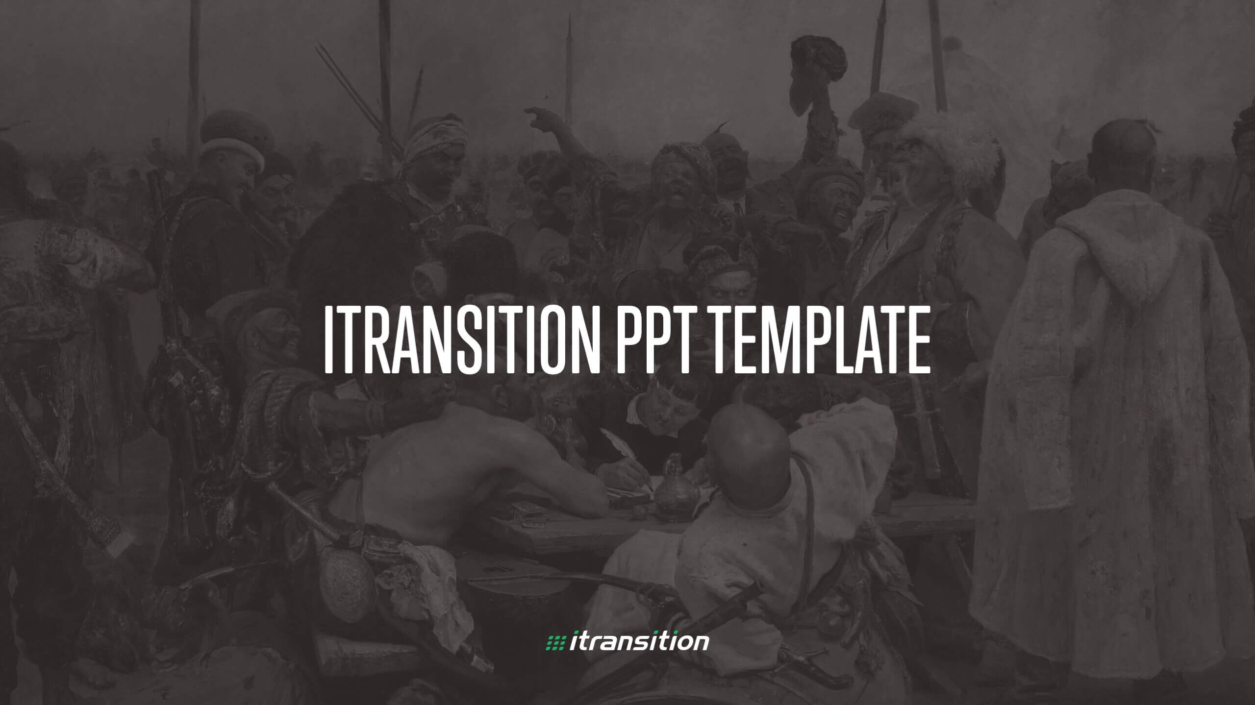
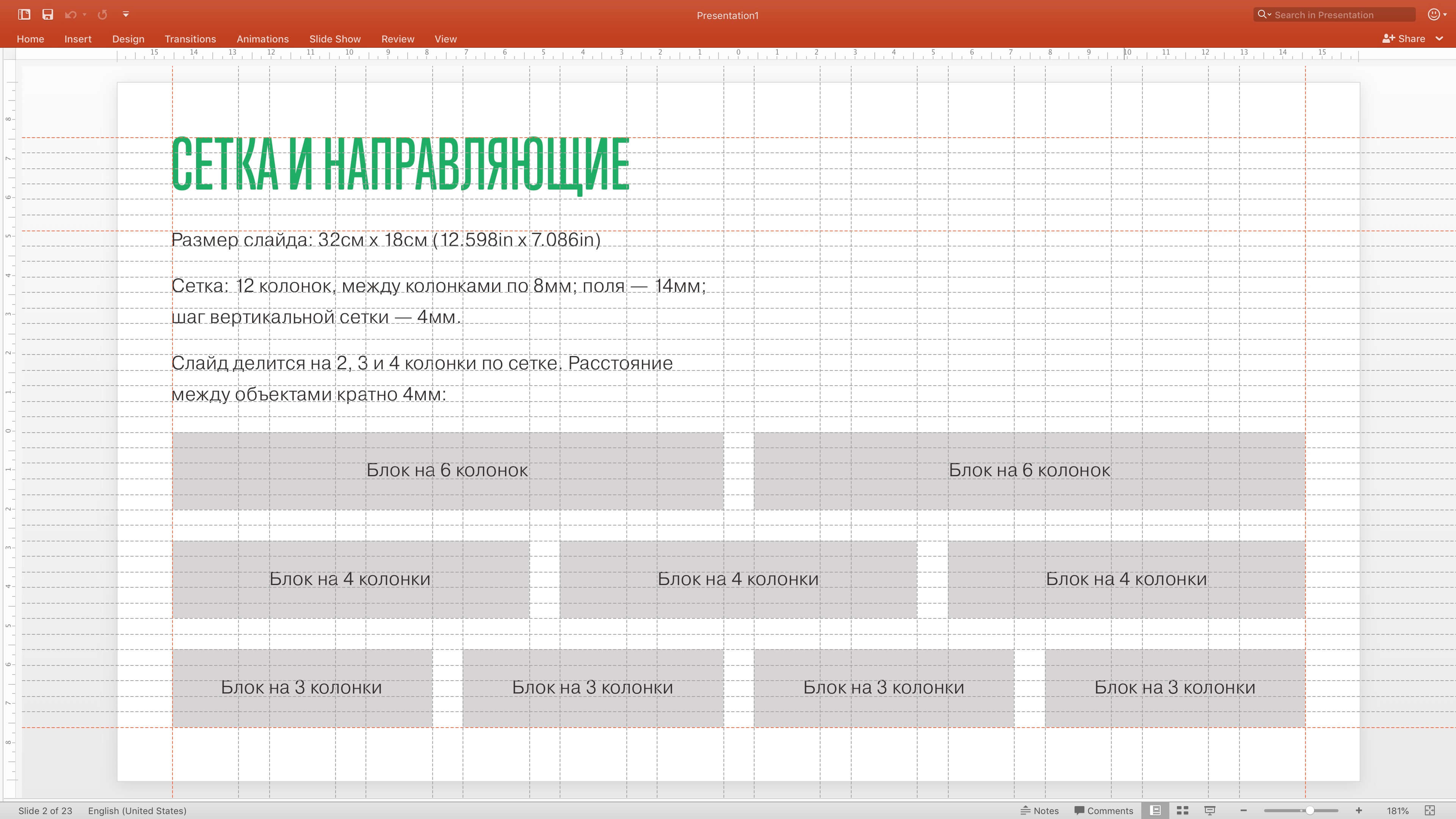
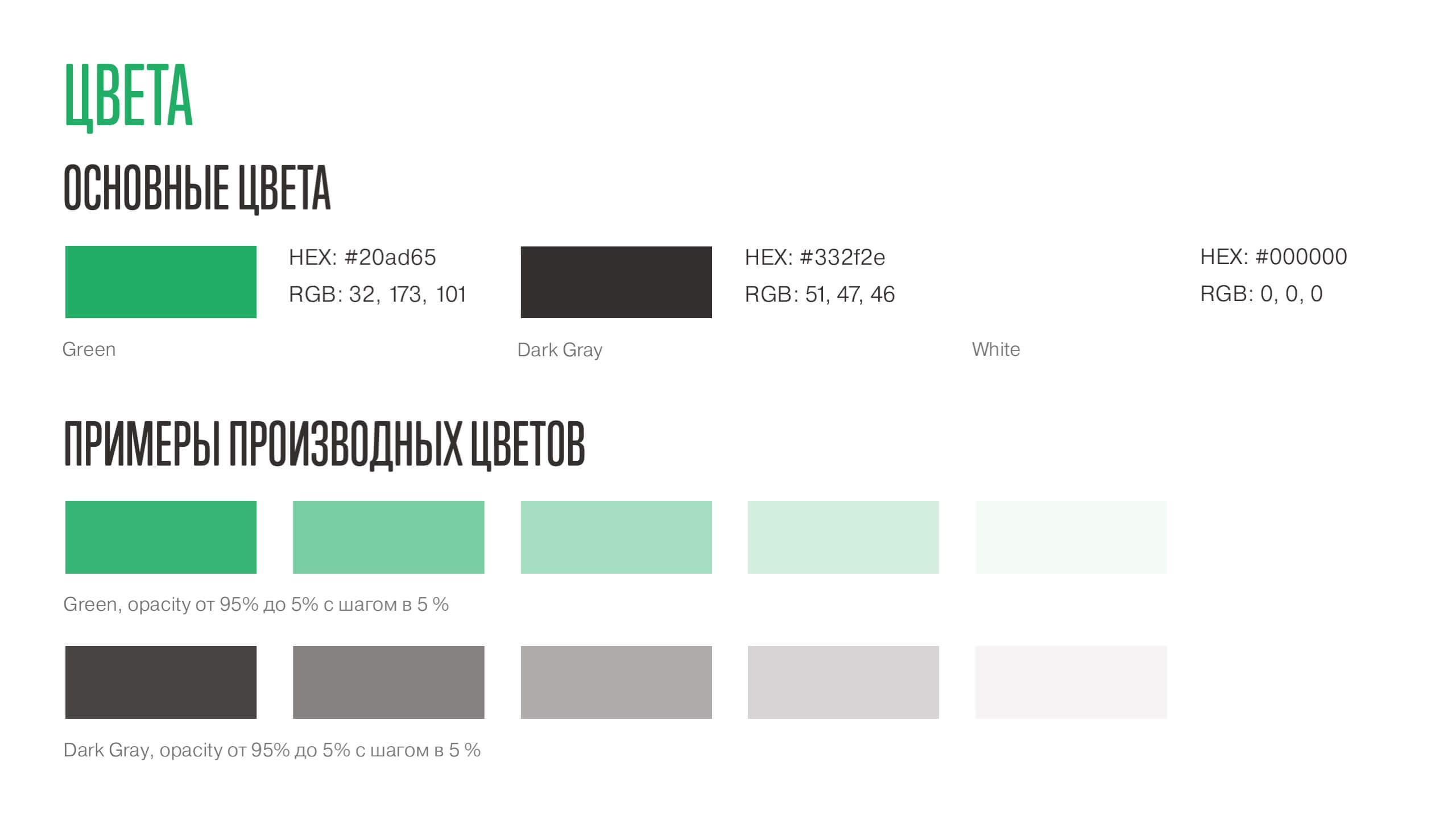
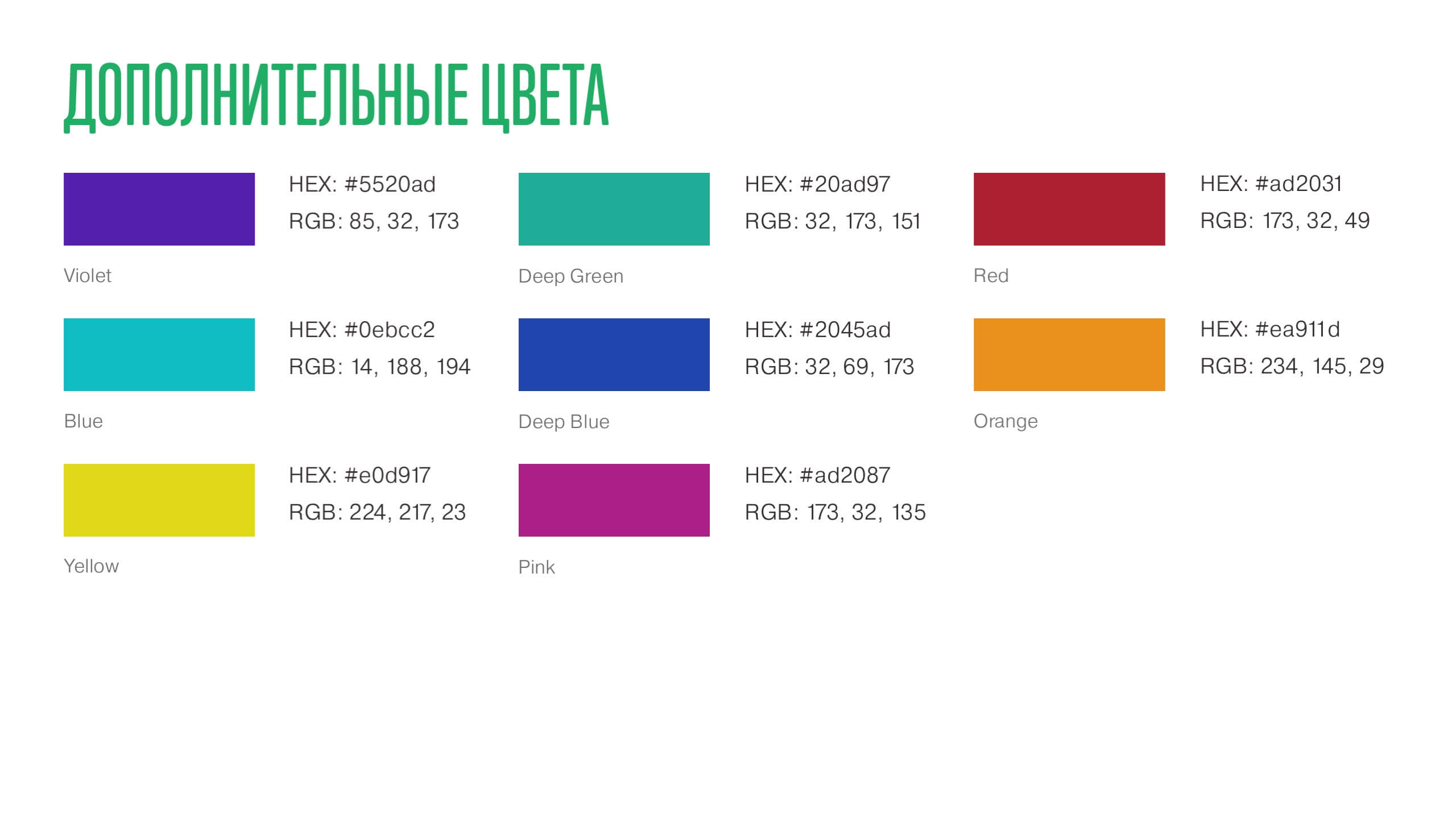
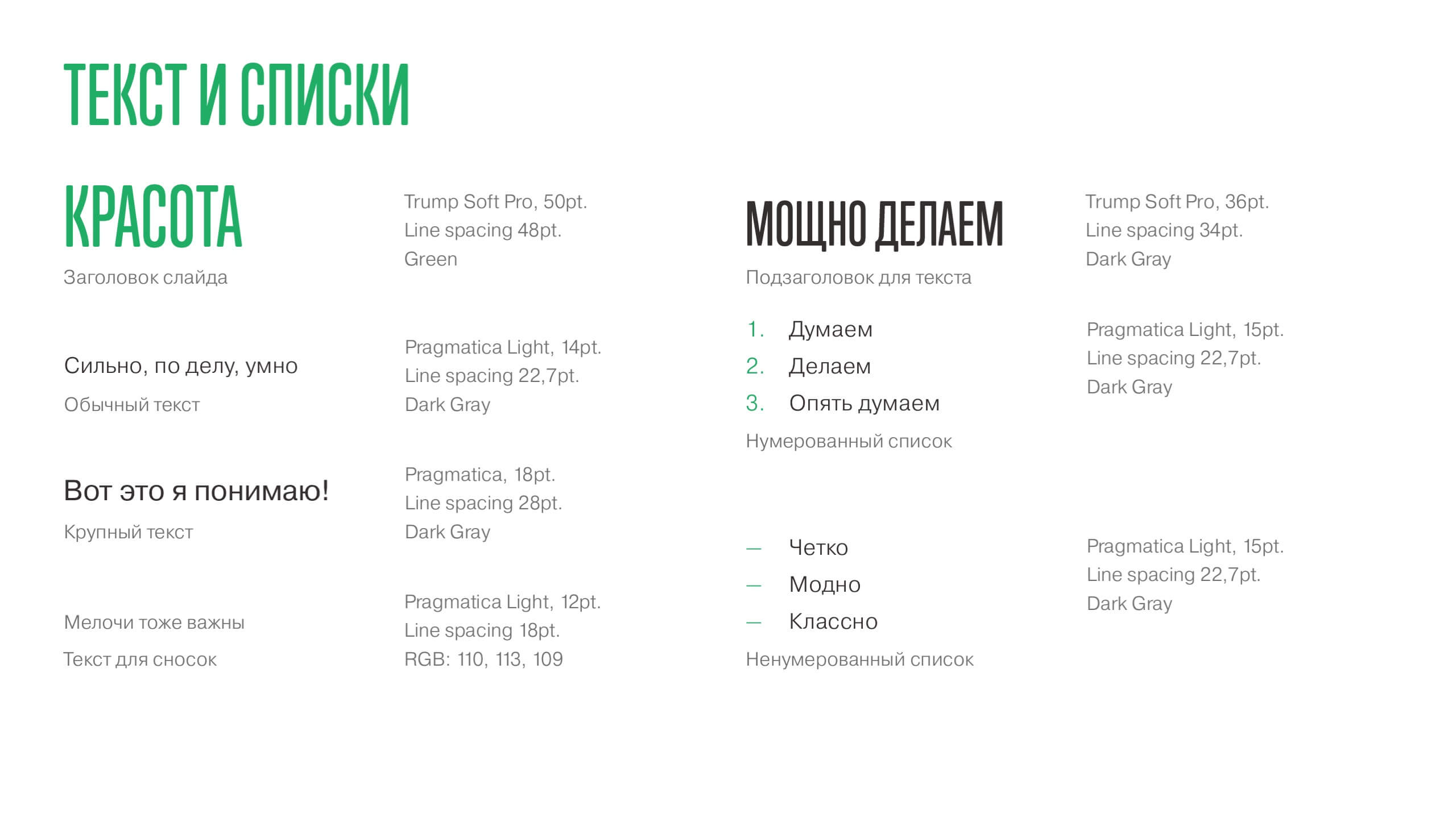
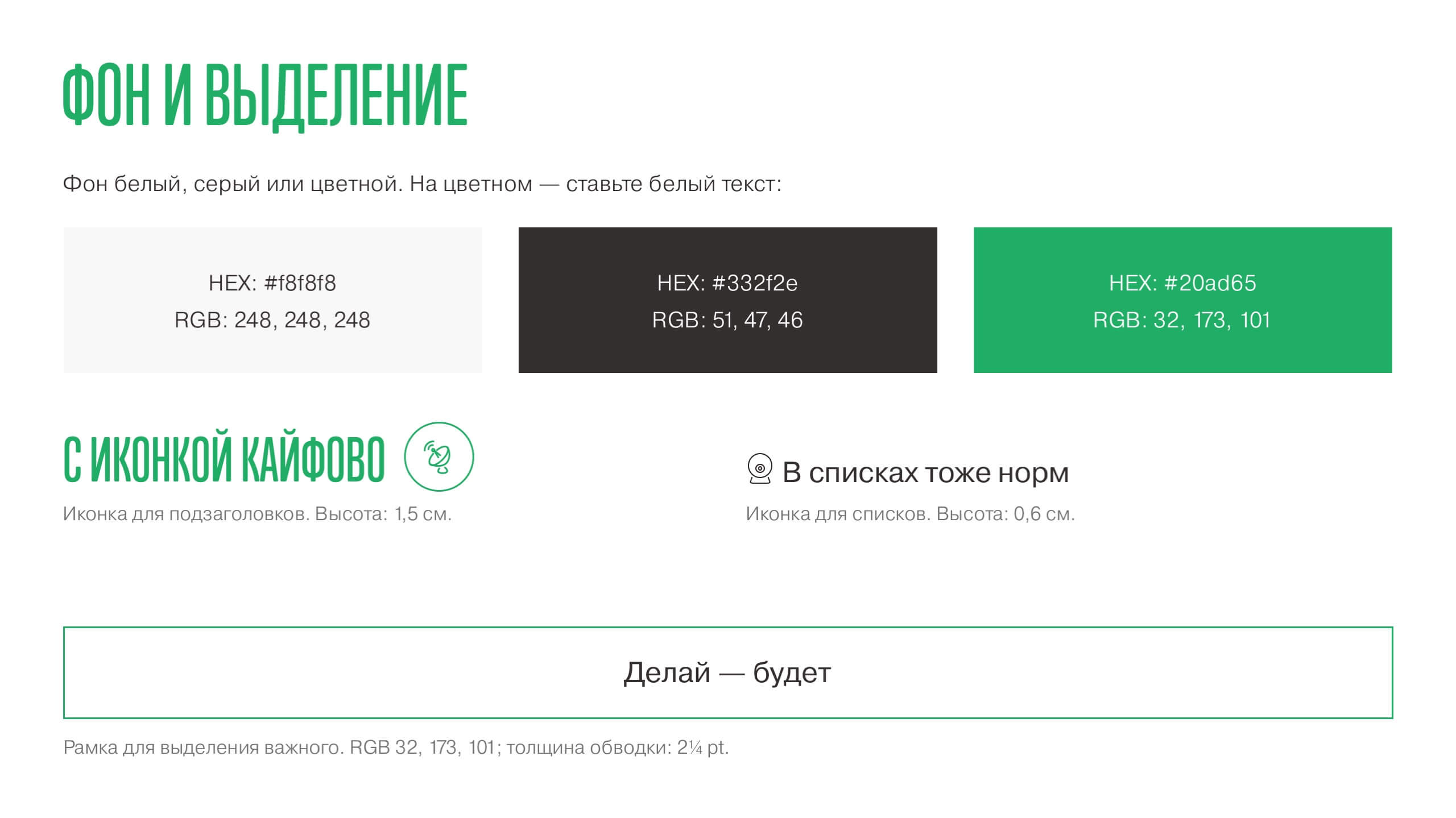
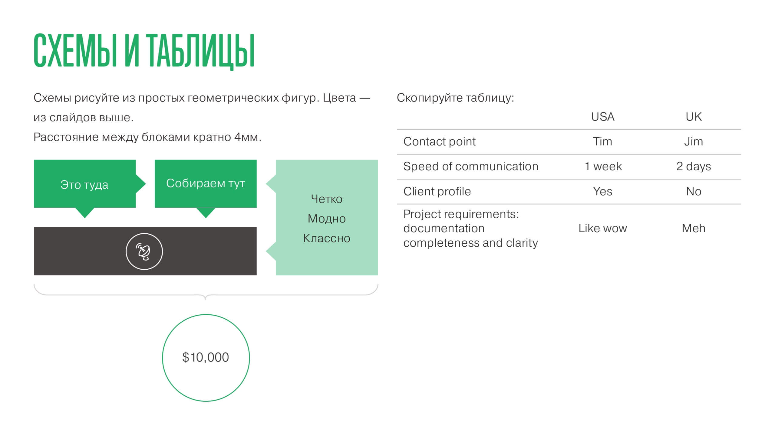
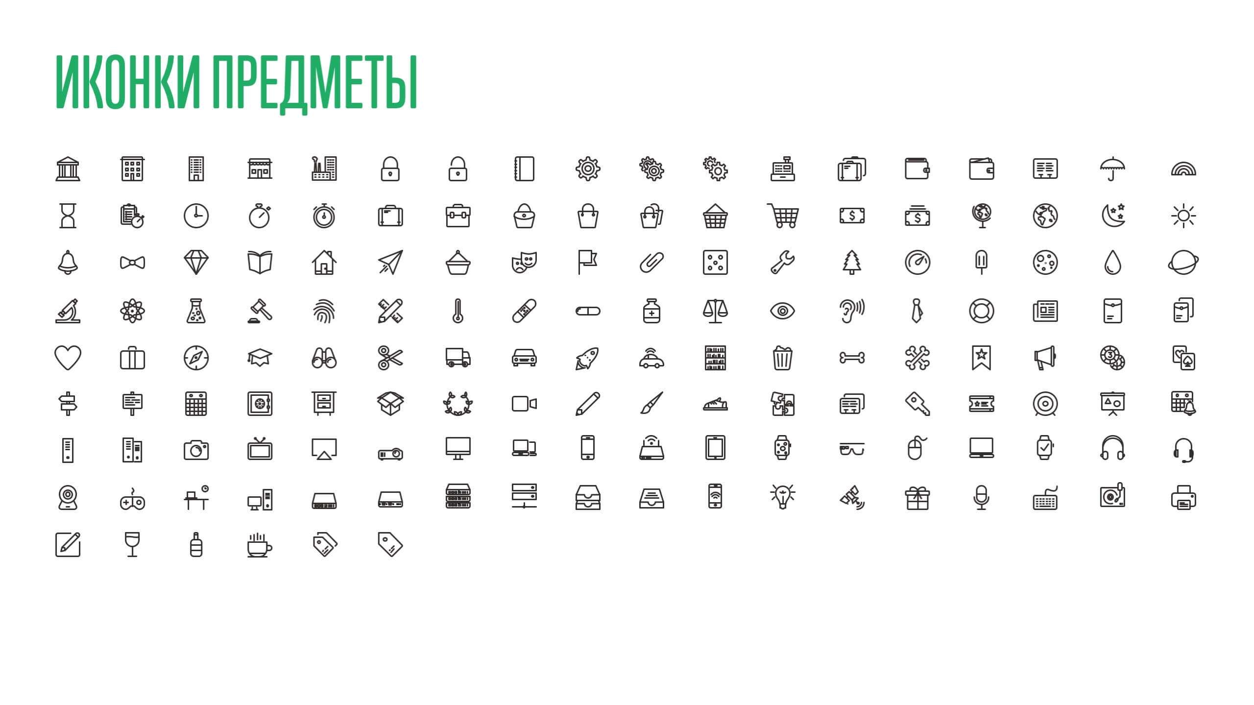
Using this template I’ve designed a world of presentations, as well as helped my colleagues to design their own.




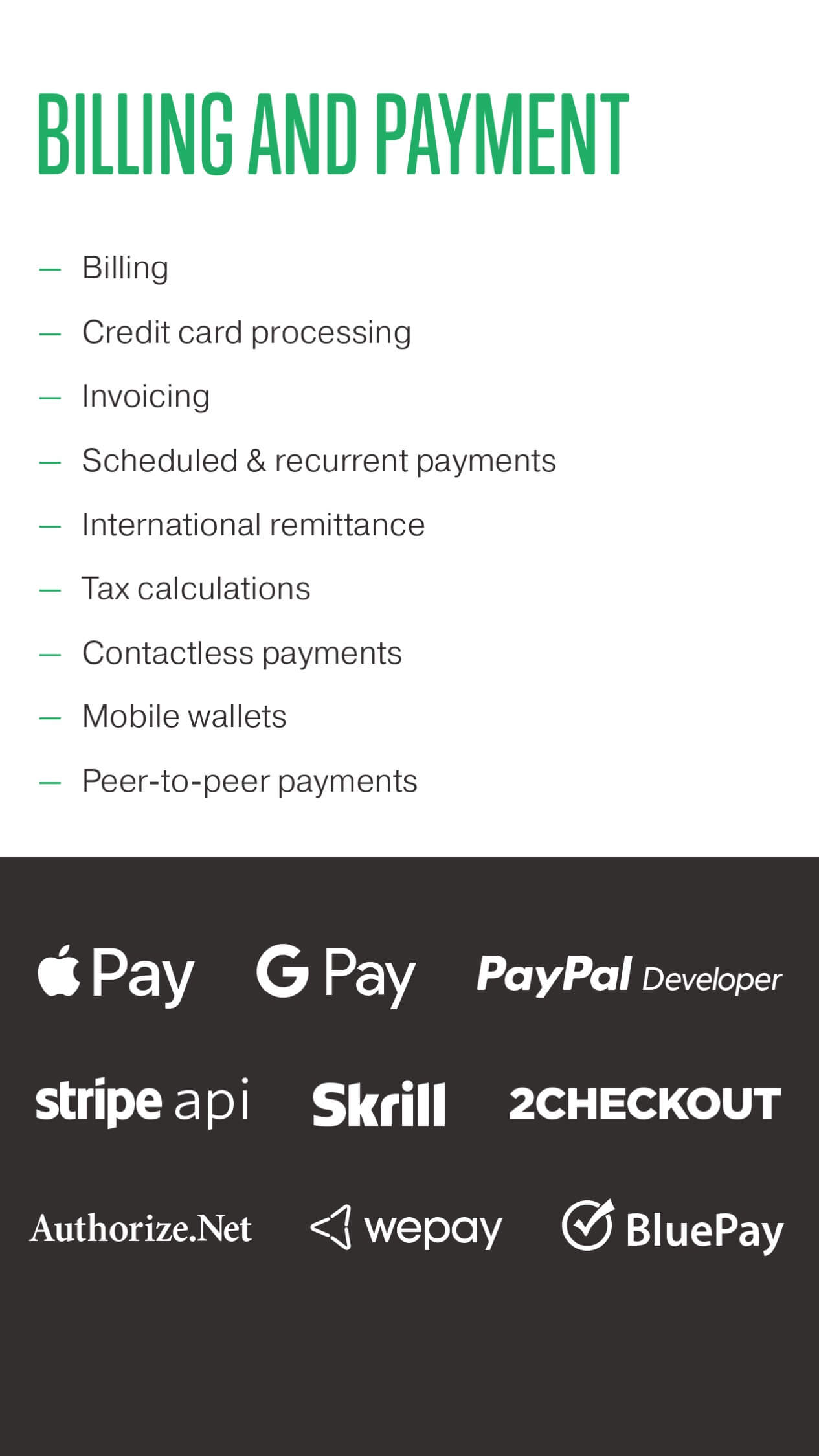
Mobile version
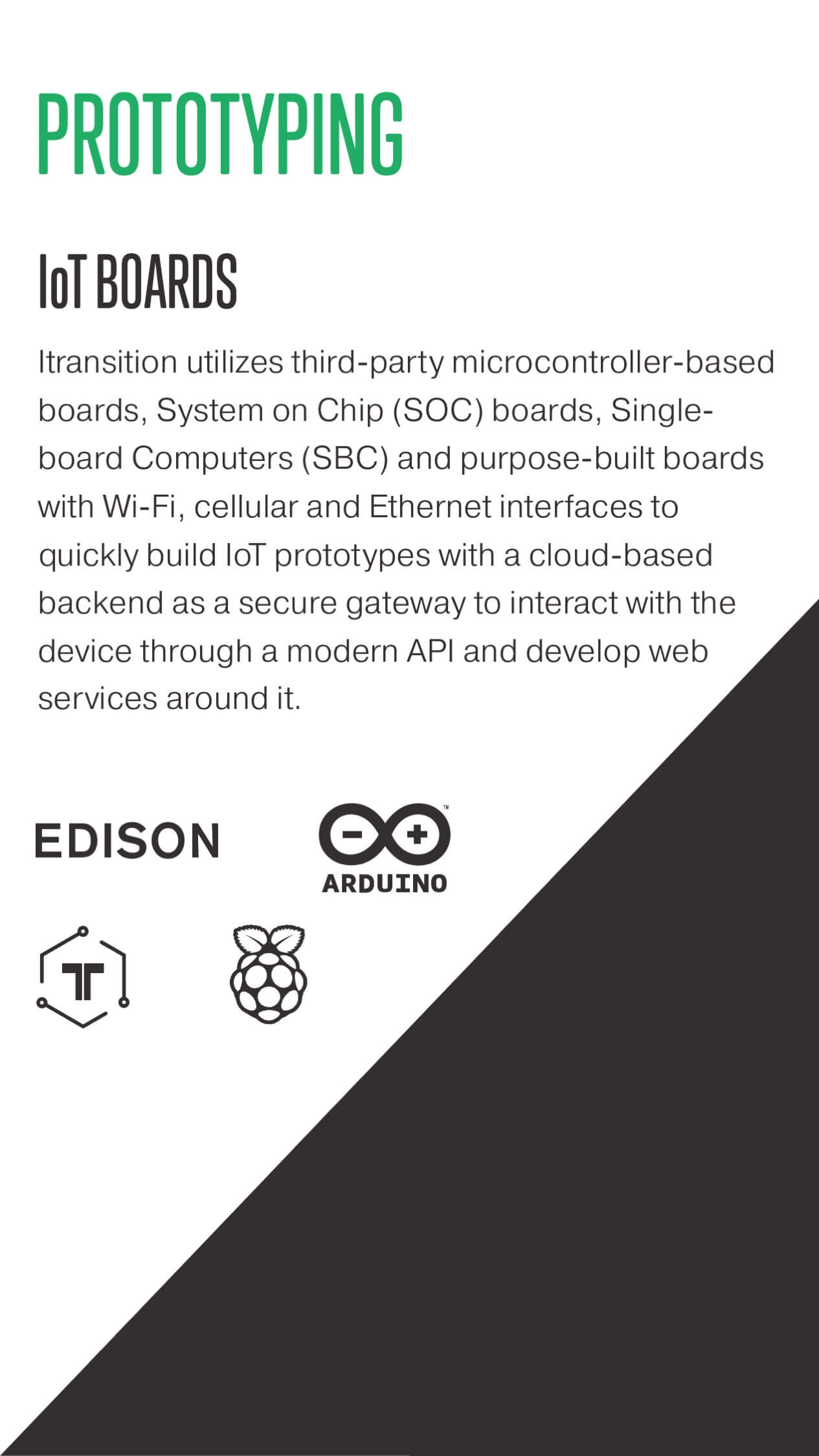
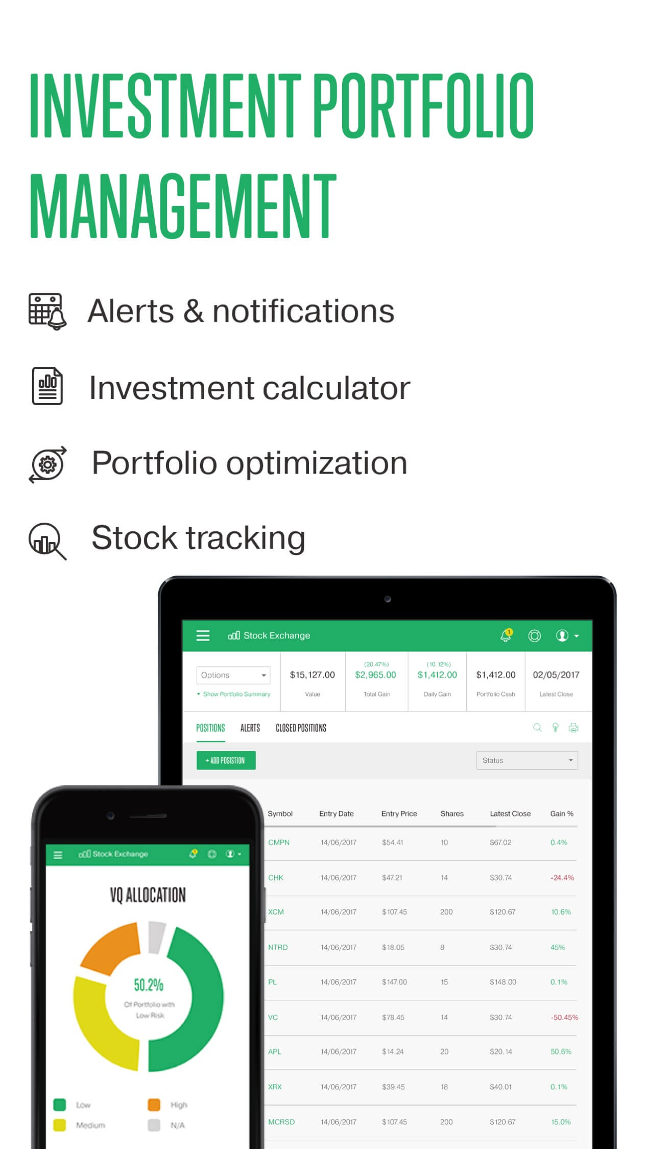
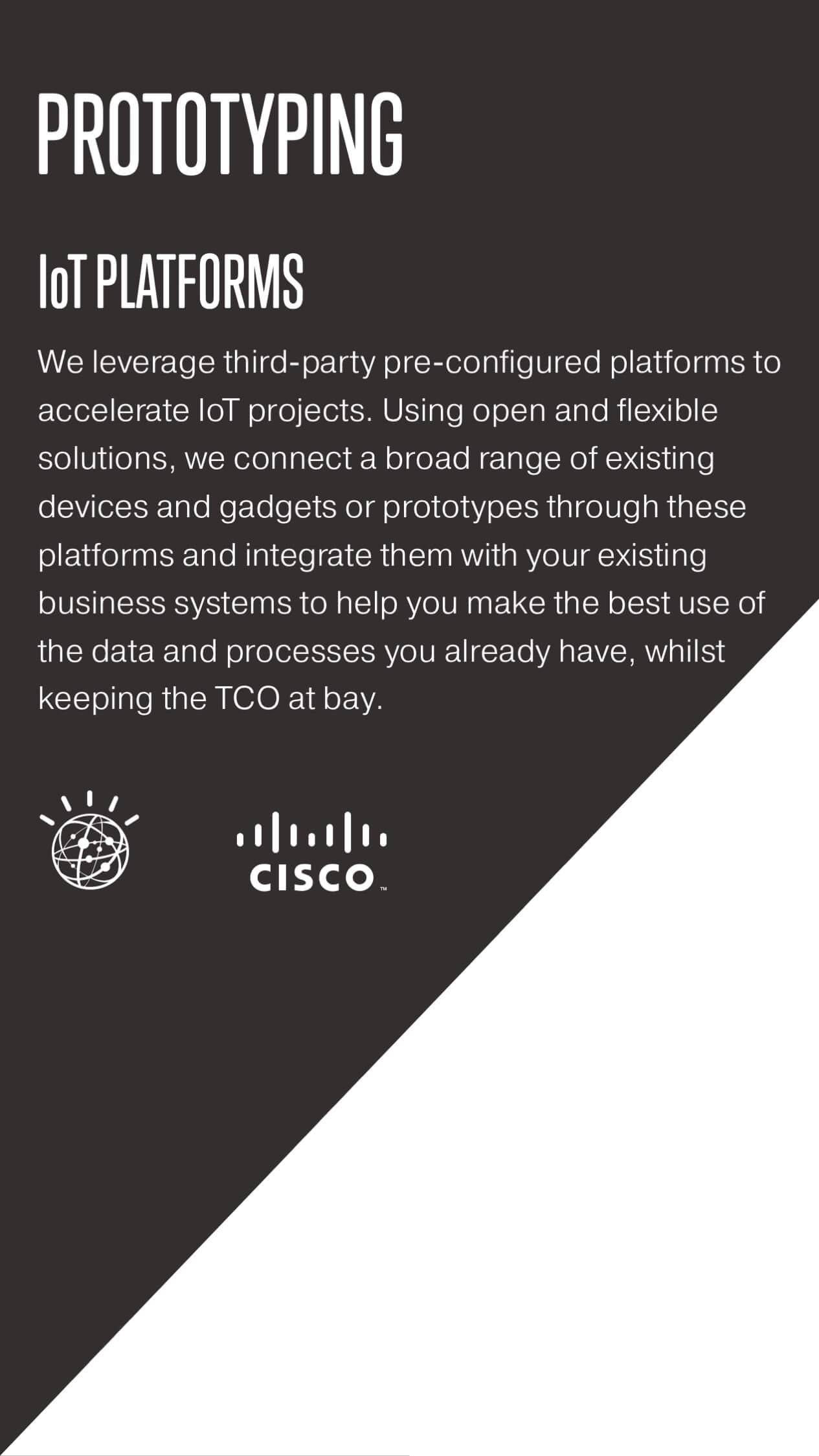
The template is well suited for big screens, but during trade shows, business lunches, and other events using a laptop for a presentation would be problematic. So after most of my colleagues had got a firm hold of the template, I took another step forward and designed a mobile version of the template.


Bonus: doc template
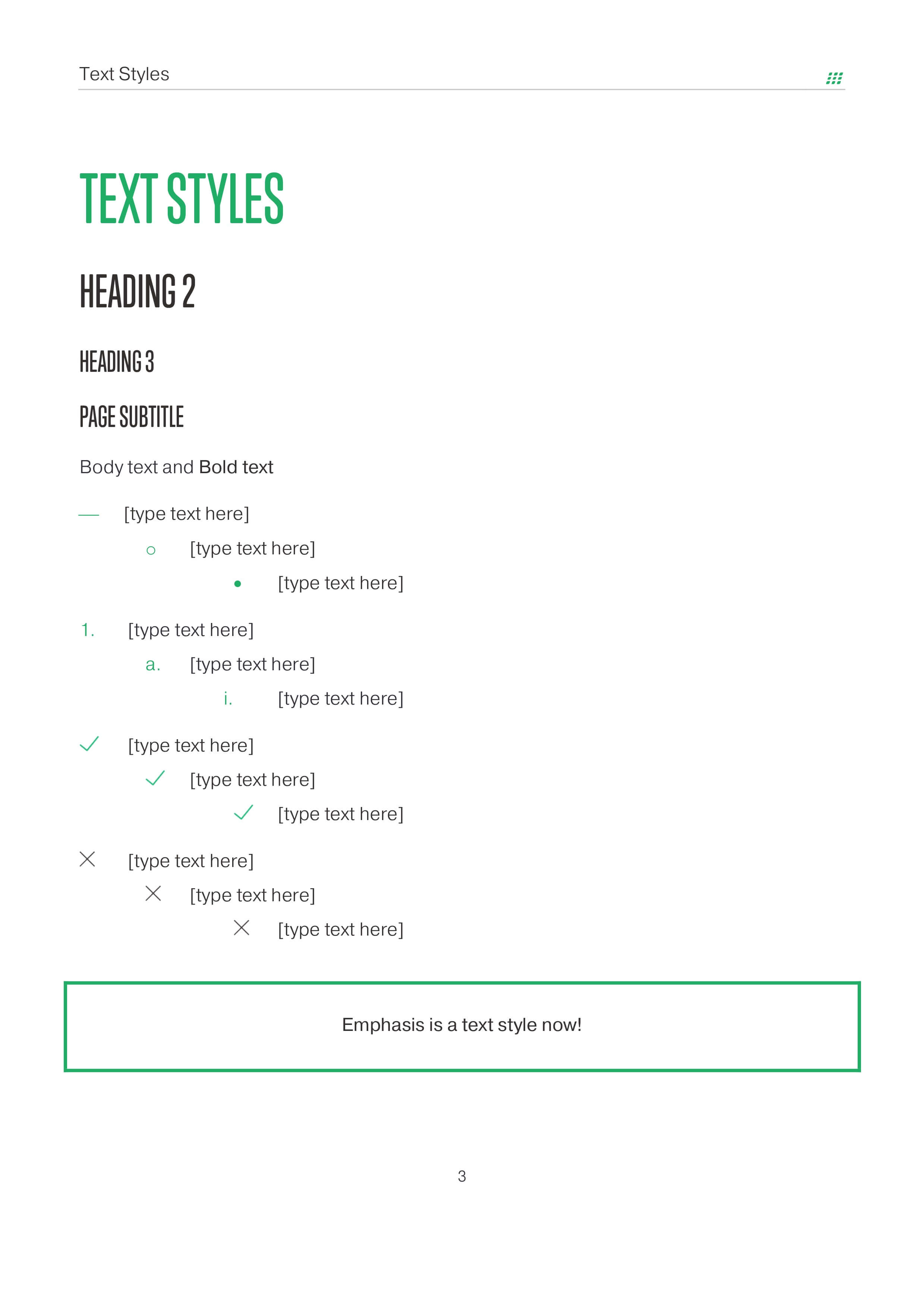
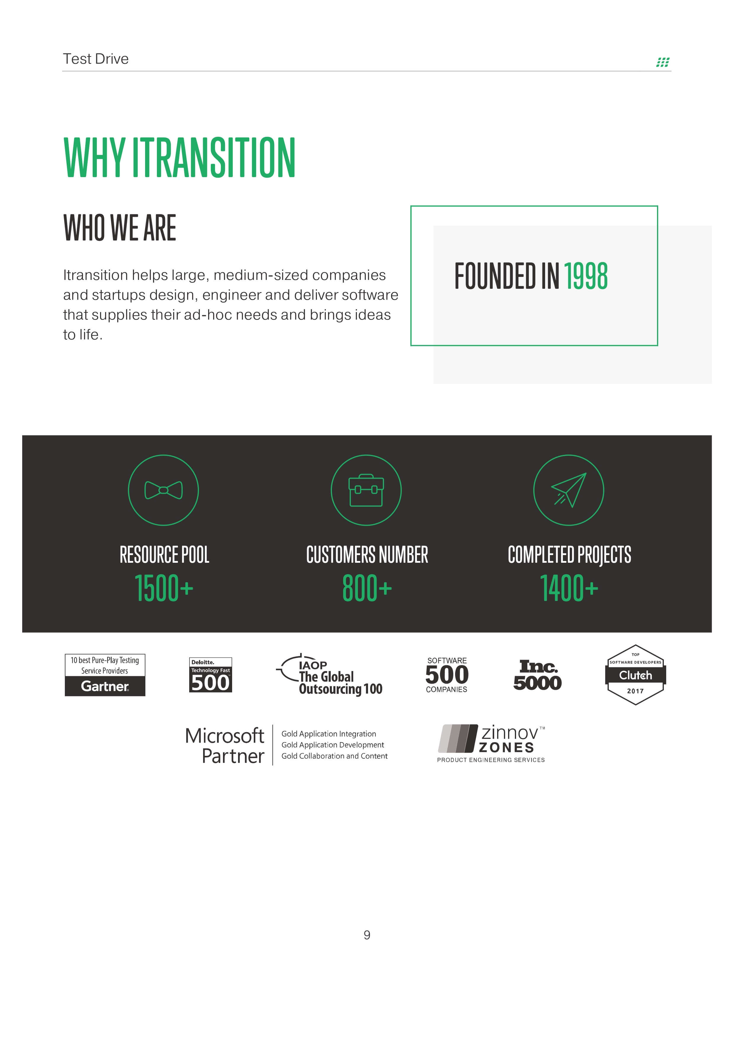
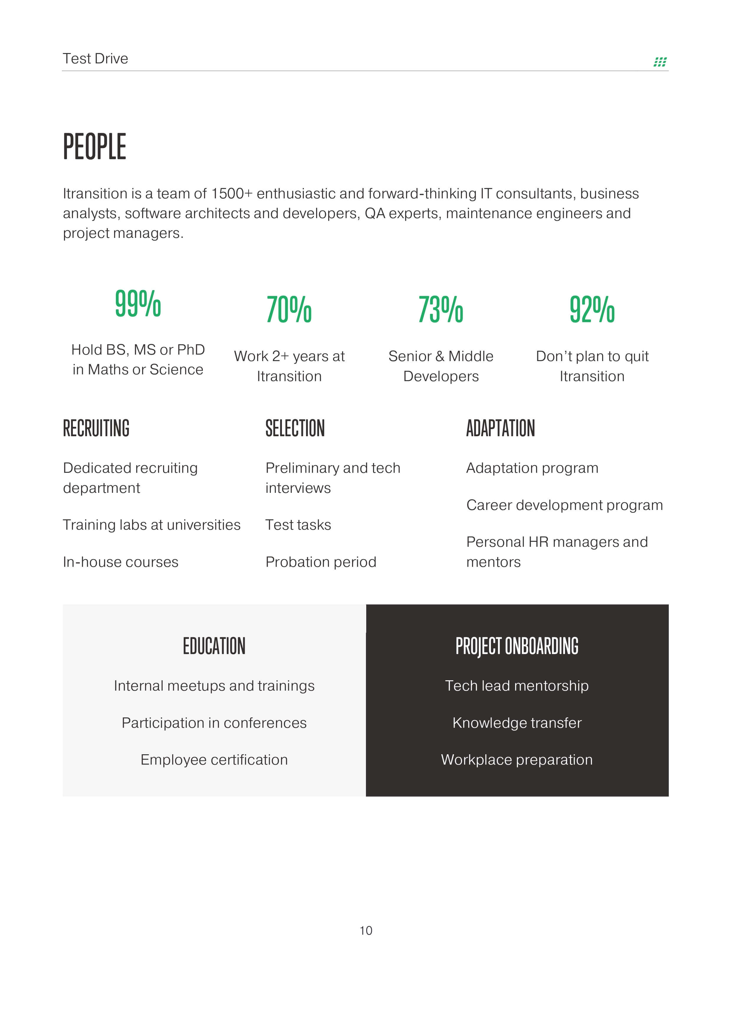
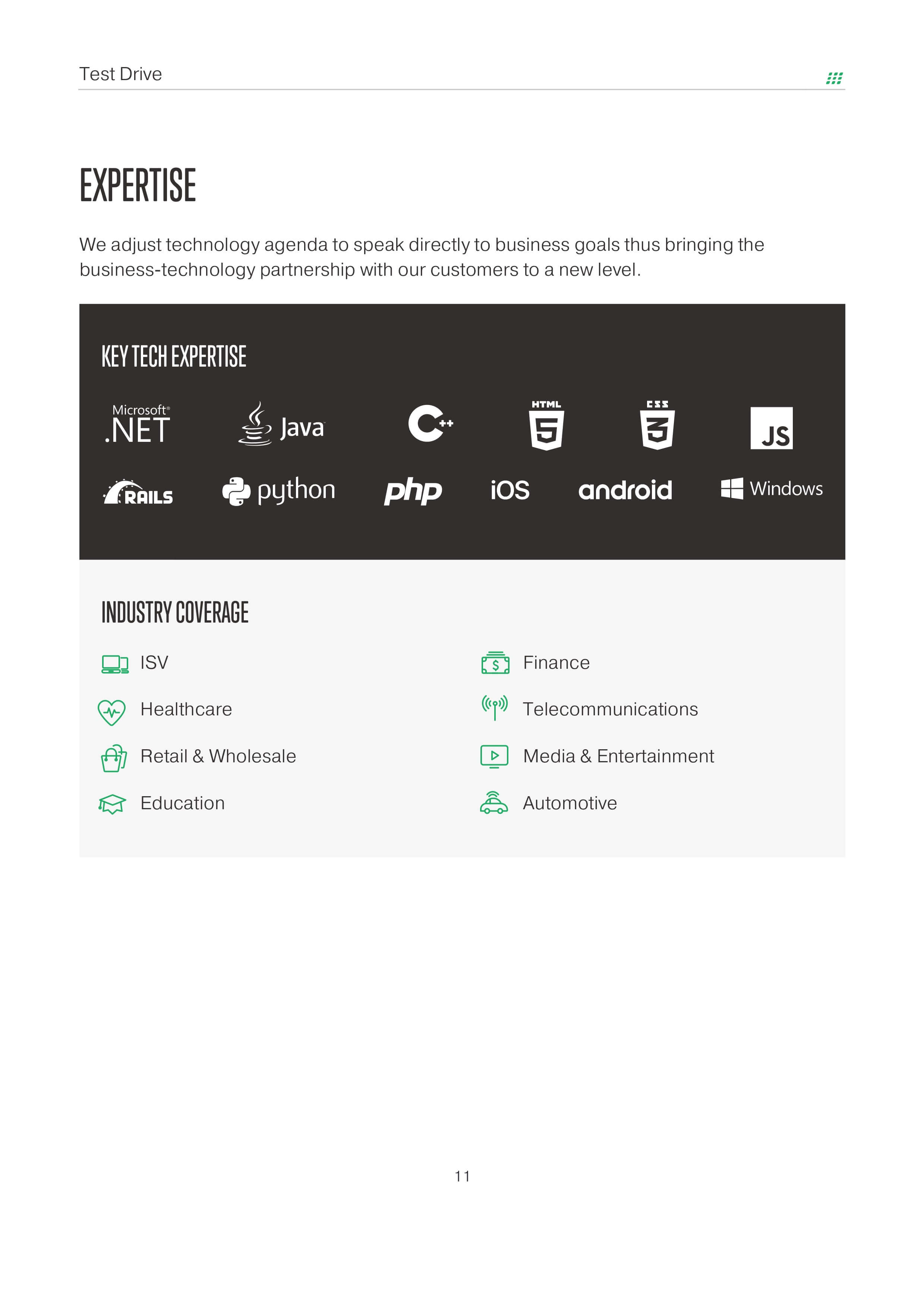
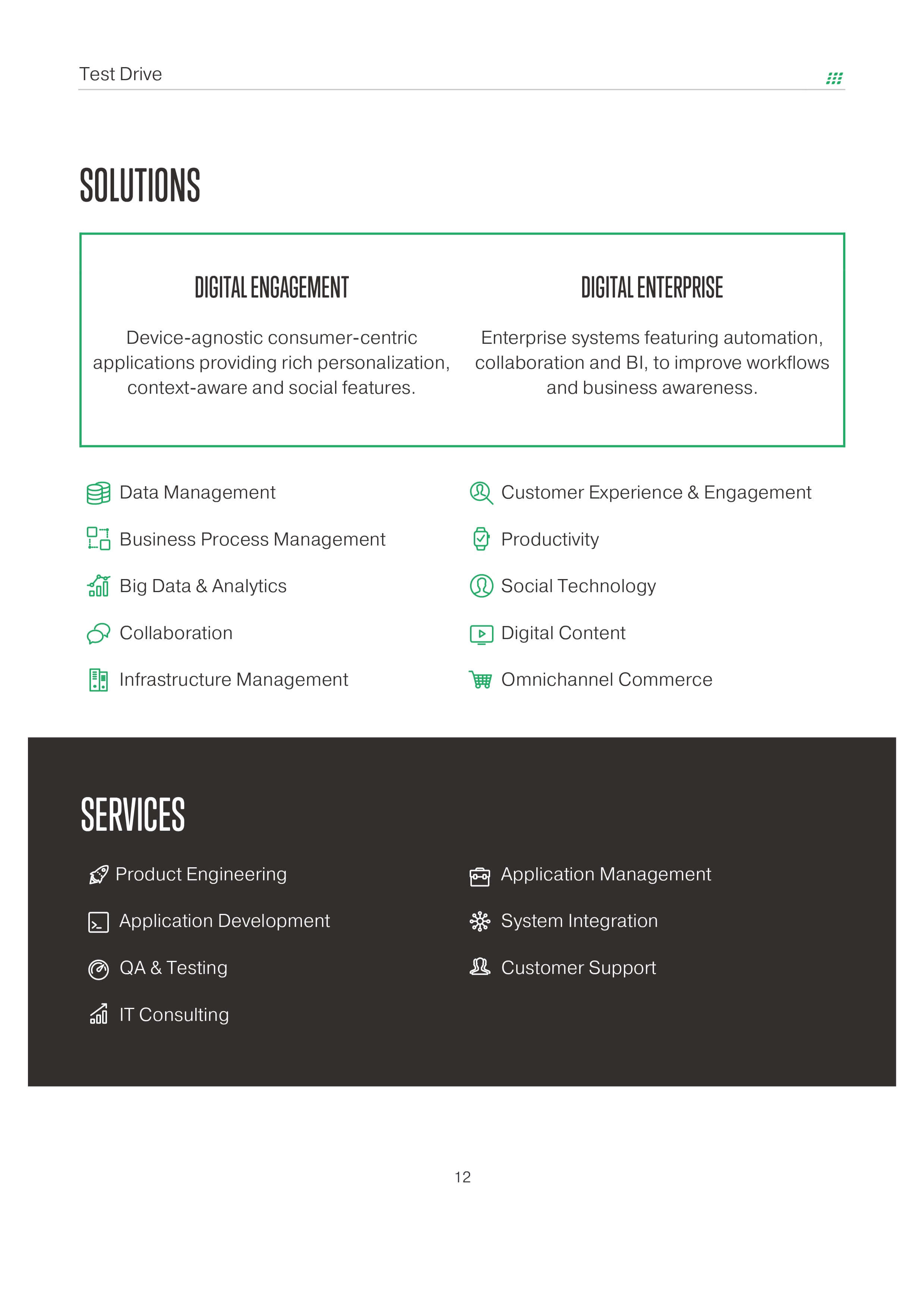
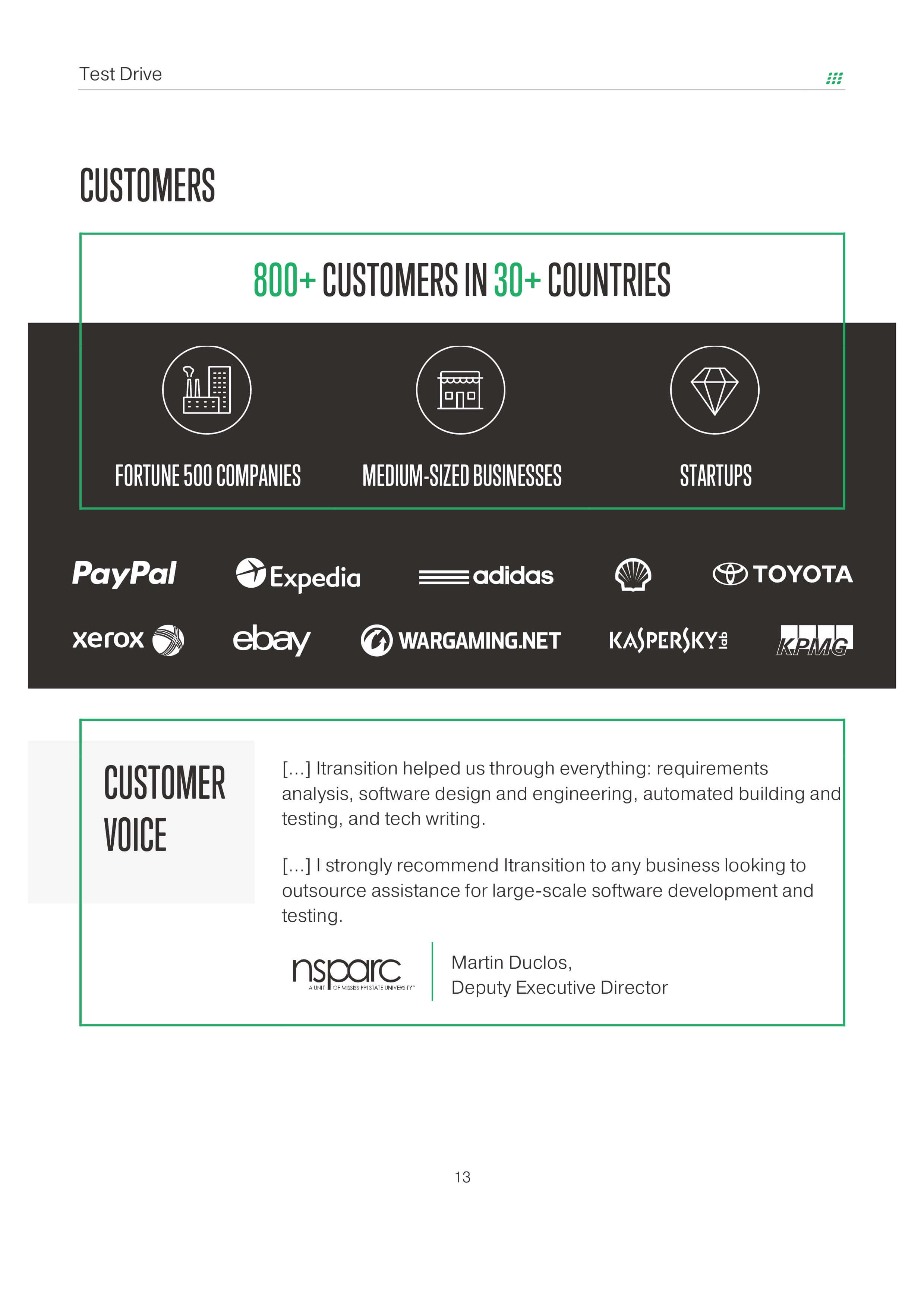
There are plenty of materials used in sales appart from presentations: case studies, proposals, etc. I’ve designed templates for documents in the same fashion.
Also sales managers are required to put some information about the company at the end of documents. In order to unify this section across all documents in the company, I took info from corporate profile and implemented in MS Word using basic Word toolkit.
