Carsharing app concept
EPAM had a vacant position for UX-designer with it’s test task being a concept for car-renting app. User story implied renting a car for a single day in an unknown city. Task included designing a screen mock-up, short method and solution description as well as making a presentation for senior designers. I successfully completed this task and got the job offer.
At EPAM designers follow Design Thinking methodology when developing a project. I considered using the same method for completing this task to familiarize myself with all it’s stages.
Empathize
Car-sharing is quite a strange theme for me: I don’t own a car, nor do I have a driving licence, only a few of my acquaintances do. In fact the whole car-sharing enterprise is quite sparse in my hometown. To identify the problems people solve with car-sharing I conducted a small research, which included:
- interviewing drivers, that are used to renting car while travelling
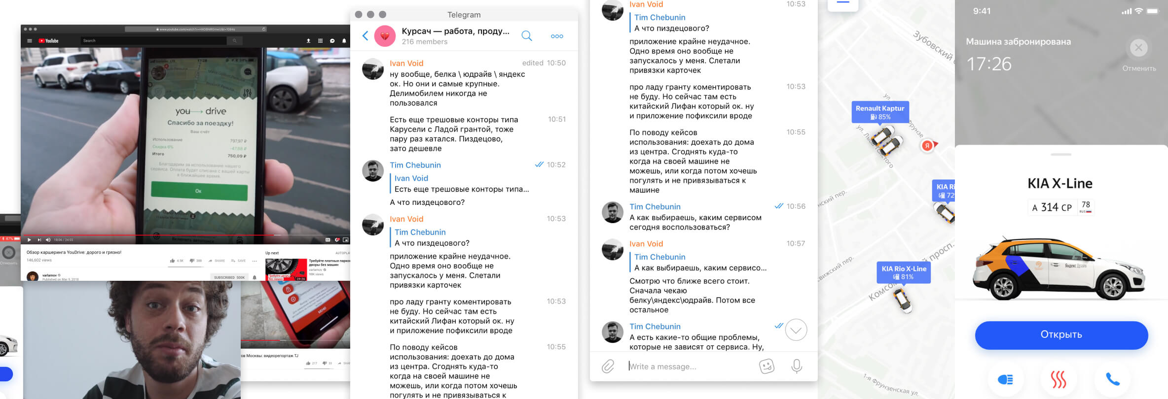
- issuing a survey in a Telegram-chat, interviewing active car-sharing users from different cities
- browsing a few video-reviews of car-sharing services
- studying some scientific publications and studies

This research concluded a list of user expectations from a car-sharing app, as well as a list of problems that an app would address in future.
- cars should be available at all times and be as close to the user as possible
- app should encourage safe parking
- all Terms and Services should be as clear as possible, especially considering pricing, parking and insurance
Considering the task and the results I got from research, I decided to focus my concept on navigation in a foreign city: app should assist in finding an available car, navigating the driver to their destination, finding a parking spot and reaching desired destination.

Define & Ideate
Using all gathered data from the previous stage I issued two Job Stories:
- When driving in a foreign city, I want to find a car quickly, reach destination safely and leave car in a convenient spot while avoiding wandering unknown streets.
- When agreeing on car-sharing Terms and Services I would like pricing, insurance and gas fees to be understandable in order not to get in trouble in a foreign city.
Based on these Job Stories I created a Journey Map comprising users’ actions, problems, interview quotes and my own design ideas. JM covers all stages of product interaction: Request, Discovery, Onboarding, Use, Retention, Offboarding, focusing on core stages for this app: Onboarding and Use.
Prototype
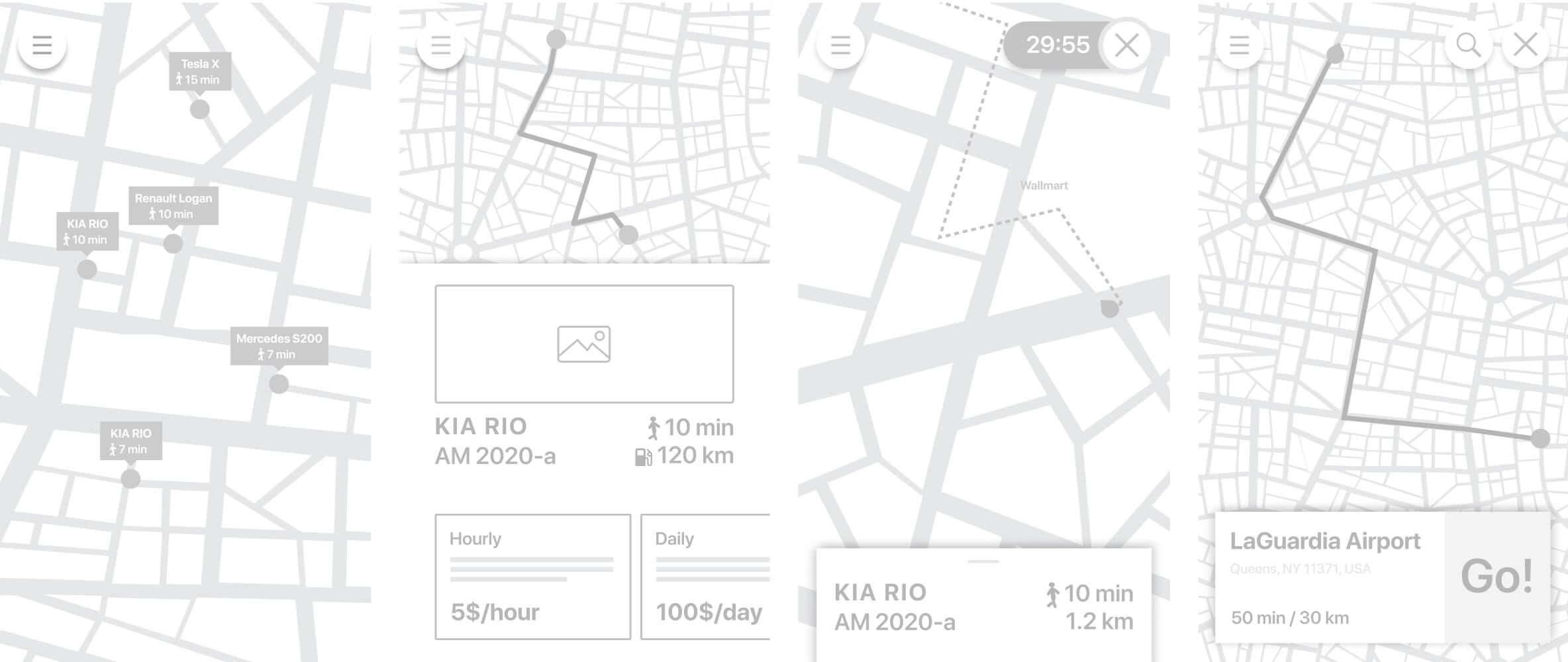
For each core stage I devised wireframes, that I later converted in a clickable prototype covering main user-flow. I also suggested a UI-design draft for one of the screens.
Wireframes on JM and UI-design 👨🎨
Test
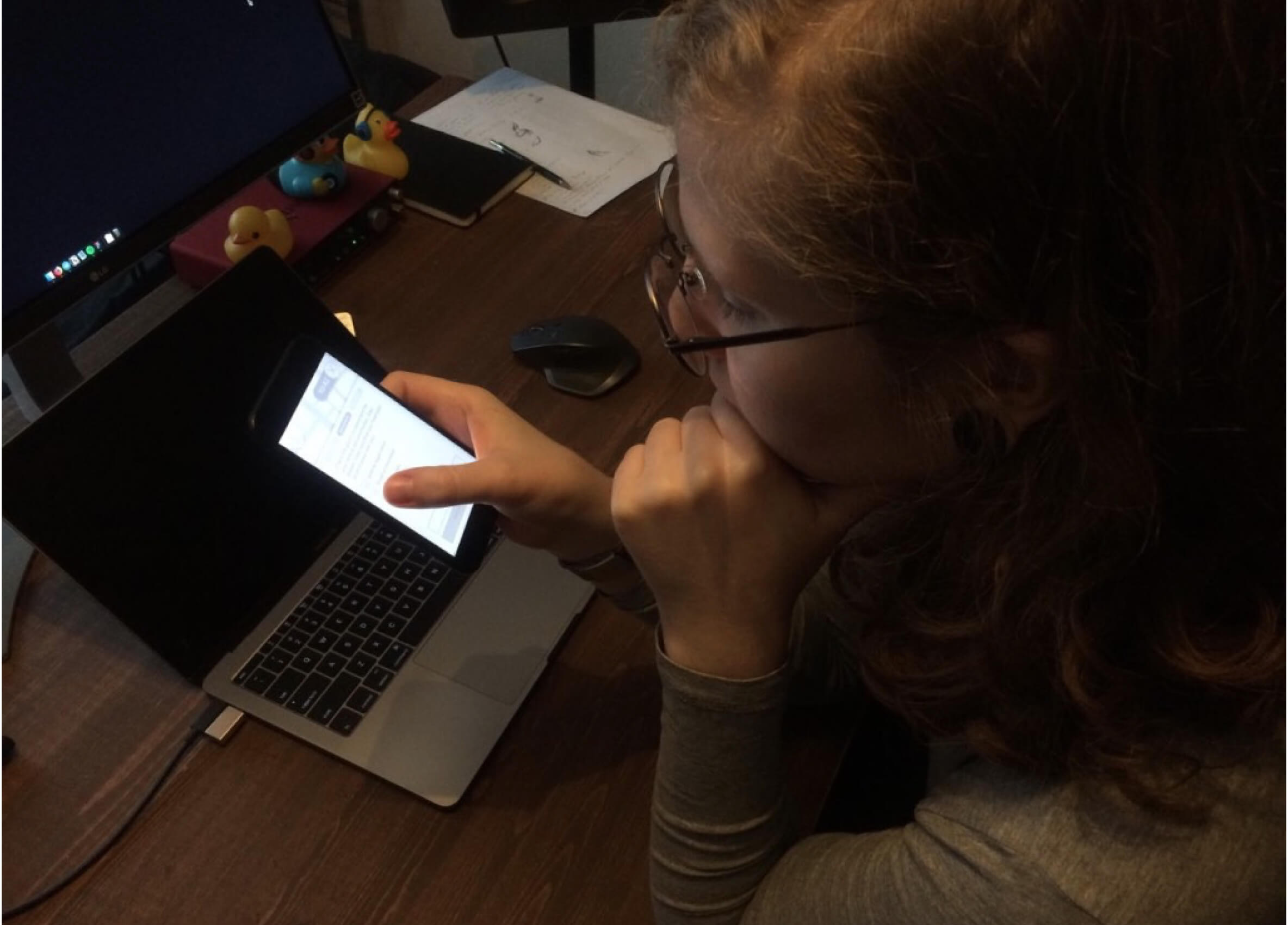
During design process I continuously conducted user testing, focusing on intuitivity of user flow, especially for the first-time users.

Presentation
I summed up my designs and working notes in a presentation and reported to my designer-colleagues, answering all of their questions. As a result I was offered the position.