Yandex Music landing page
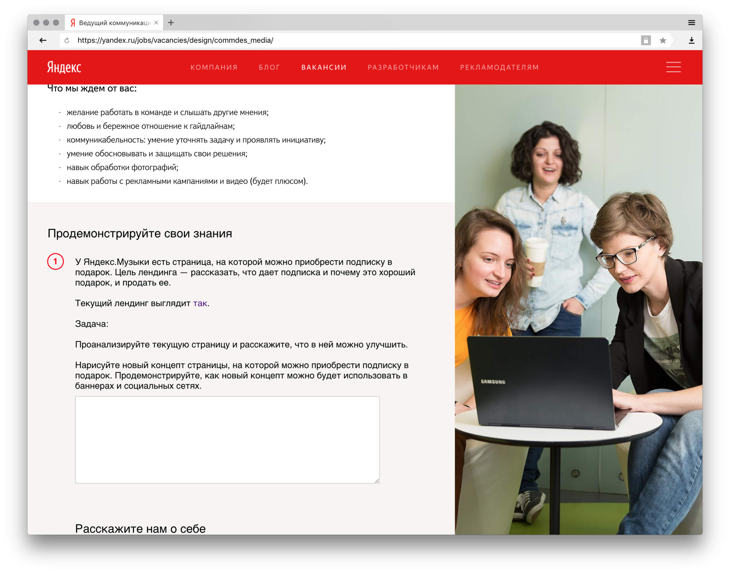
Yandex was looking for a new designer for their Music division. Applicants were offered a test task I found quite interesting. Despite not having applied for the job, I completed the task.
Task
Test task required to redesign a landing page for gift certificate service of Yandex.Music. Redesign also should have strong visual keys that would be used in advertising.
Before redesign the landing looked like this:
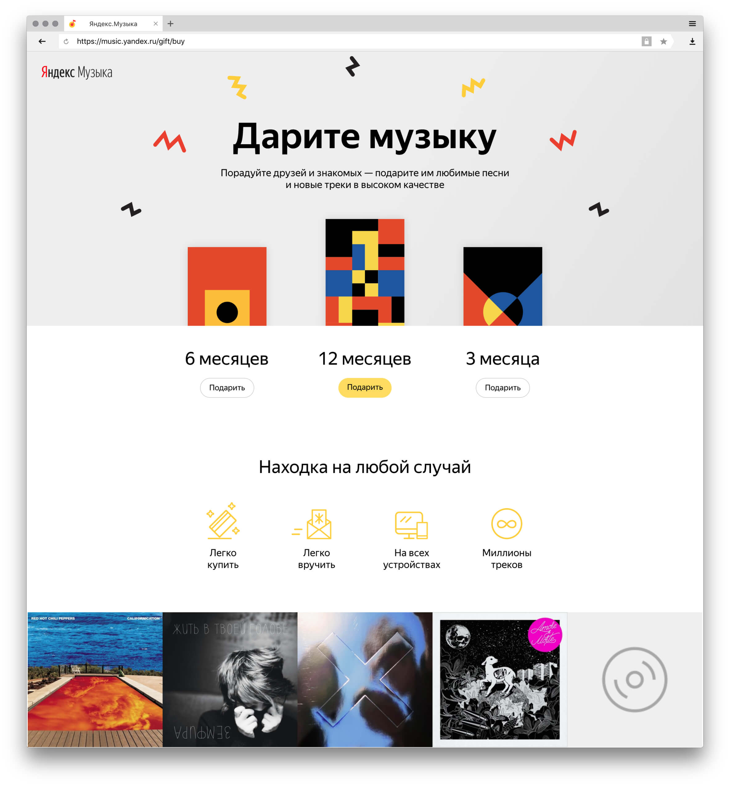
Users mainly come across this page, when looking for something to gift to their relatives and friends. My theory was that this page’s conversion was lowered because there was not enough vital information for clients.
I conducted a small survey among my peers trying to find out what they find most important while making a certificate purchase. Three most popular trait were: how does one pay and is such payment a safe one, how does one actually gift something digital, and would such a gift be relevant for everybody. On new landing page I tried my best to answer these questions respectively.
See adaptive prototype in a new window 📱
Here I would like to address specifically some of the task’s parts as well as overall visual language.
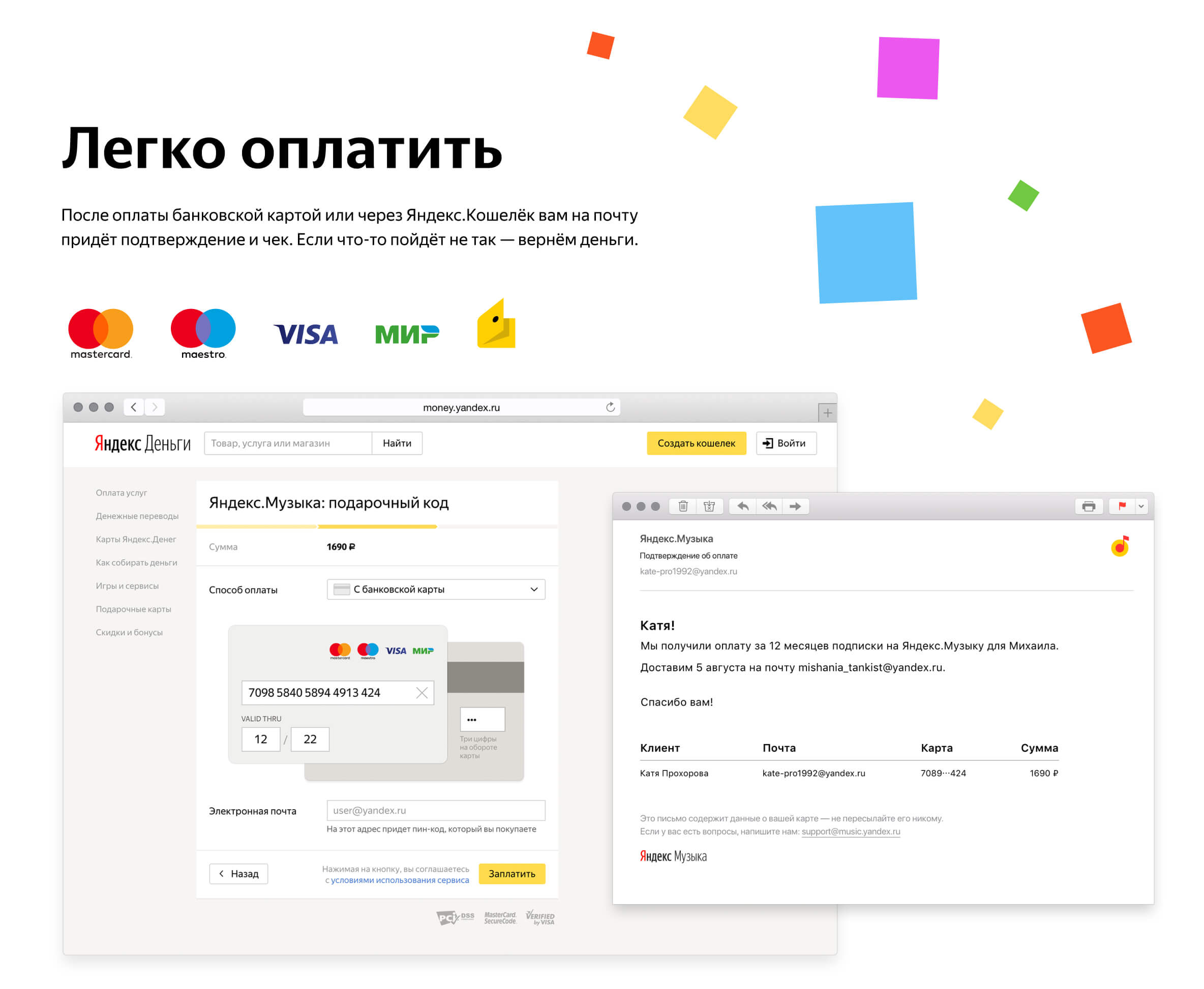
How to pay
Much of russian-speaking users are still not quite accustomed to online payments. I try to lift this anxiety by clearly explaining to users what happens when they complete the payment.
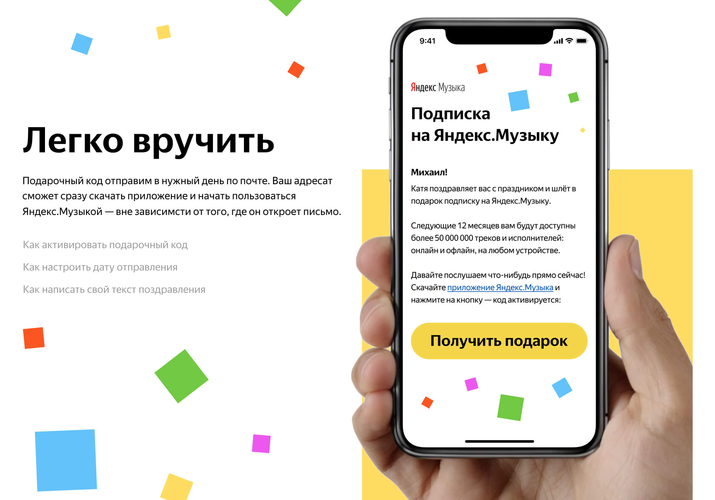
How to gift
In this section I show users what the certificate looks like and give links to FAQ about gifting. For users not to be afraid to gift something they couldn’t touch, everything possible is done.
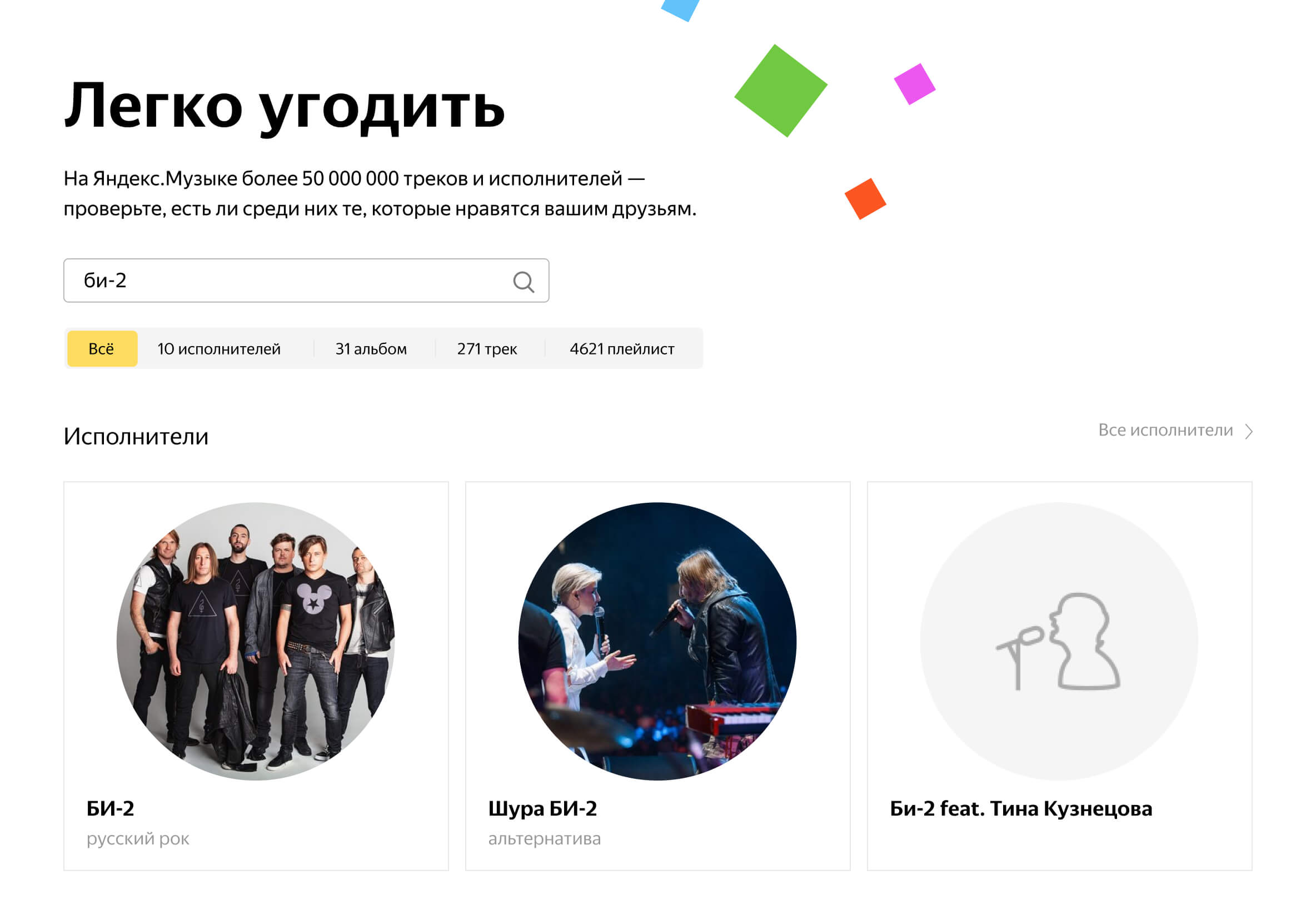
Will my gift be relevat
One of the spreaded fears I had to dispel was: what if it’s not the kind of music my friend likes? I built in on-site search from Yandex.Music to show the user how vast its media library actually is. The user is now assured their gift is fitting.
Visual language
Right before publishing this test task Yandex’ team introduced new guides for their playlist visualisation. New designs will be based on colorful squares which is a visual clue to musical album.

I embraced these clues and added a bit of context to it. On one hand Yandex.Music is a vast library of tracks and playlists, on the other — a celebration. I use these small colorful squares in layout as confetti of albums.
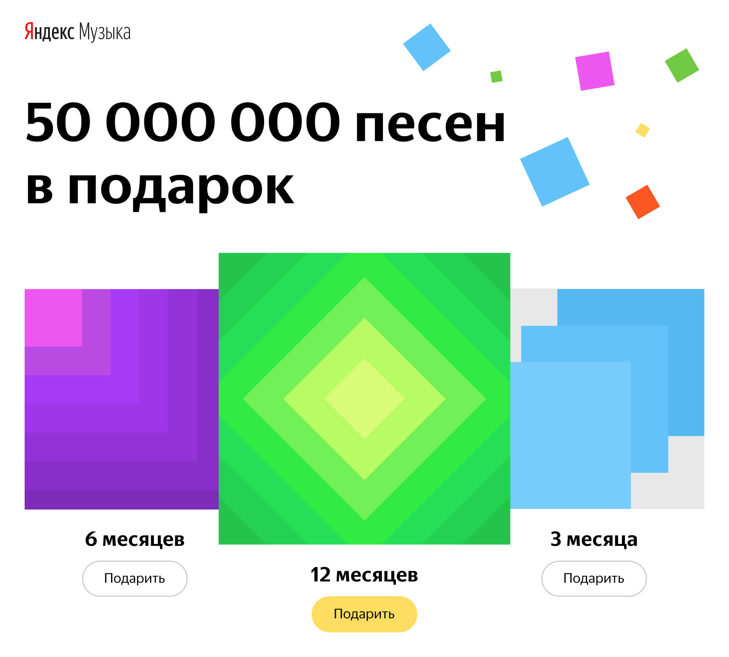
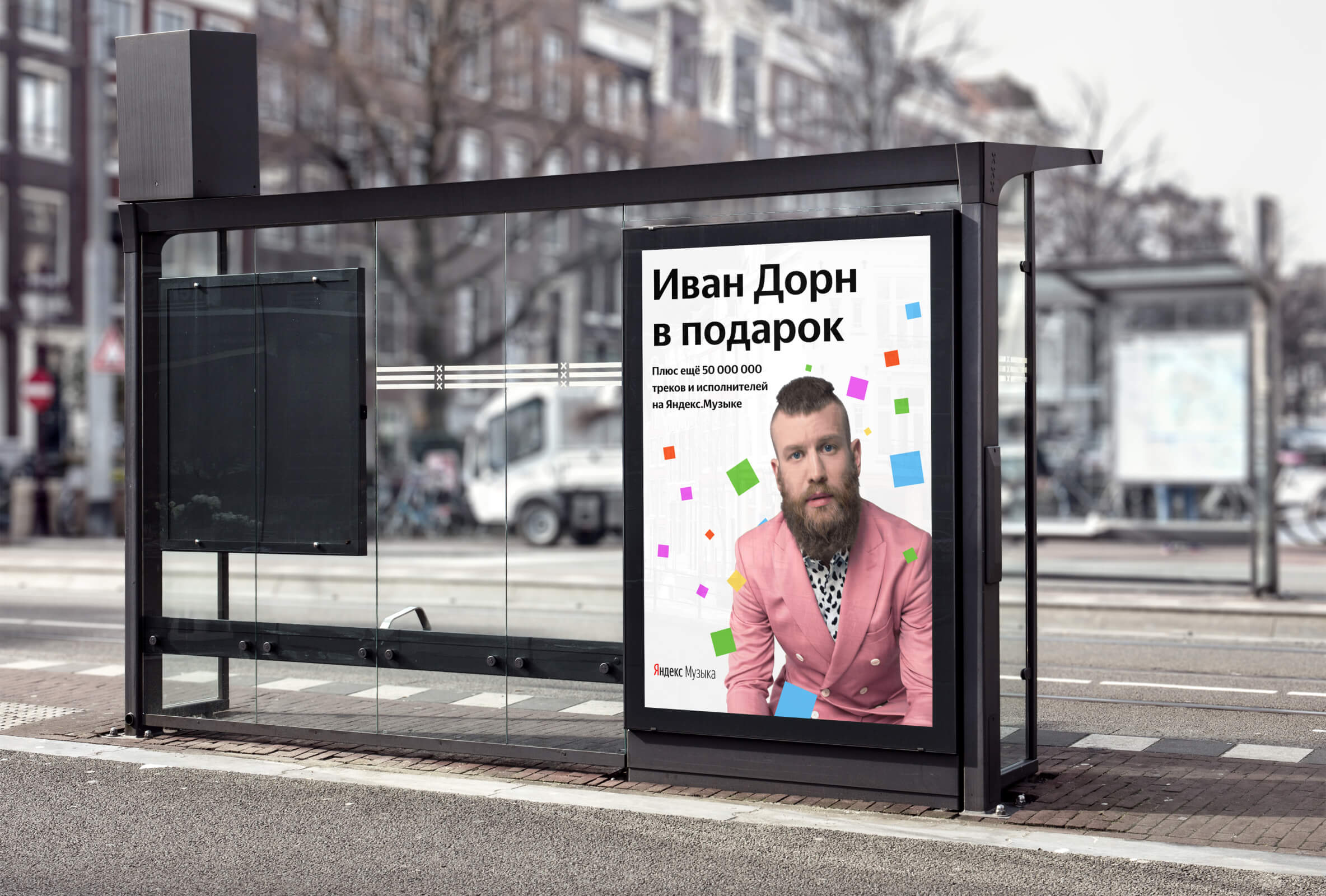
This visual key could easily be used in any format: web-pages, posters, bill-boards, banners.
What’s left — to test hypothesis if conversion would actually benefit from this redesign.