Global graphics portal redesign
In 2018 I helped a EPAM client to redesign their graphics portal which is being used by news editors, journalists, and graphics teams around the globe. The system allows editors and information designers to host and share images, infographics and interactive graphics. At the same time, journalists are able to copy a link to a graphics and paste it to an article to provide readers with illustrations and statistics.
Challenge
The main focus of the project was on the current solution migration to the AWS cloud, preserving all the functionality and user-flows within the front-end libraries limitations. Thus, the main design challenge I've faced was to refresh the look and feel of the portal. At the same time, I've decided to try to improve current user experience without changing global flows.
Solution
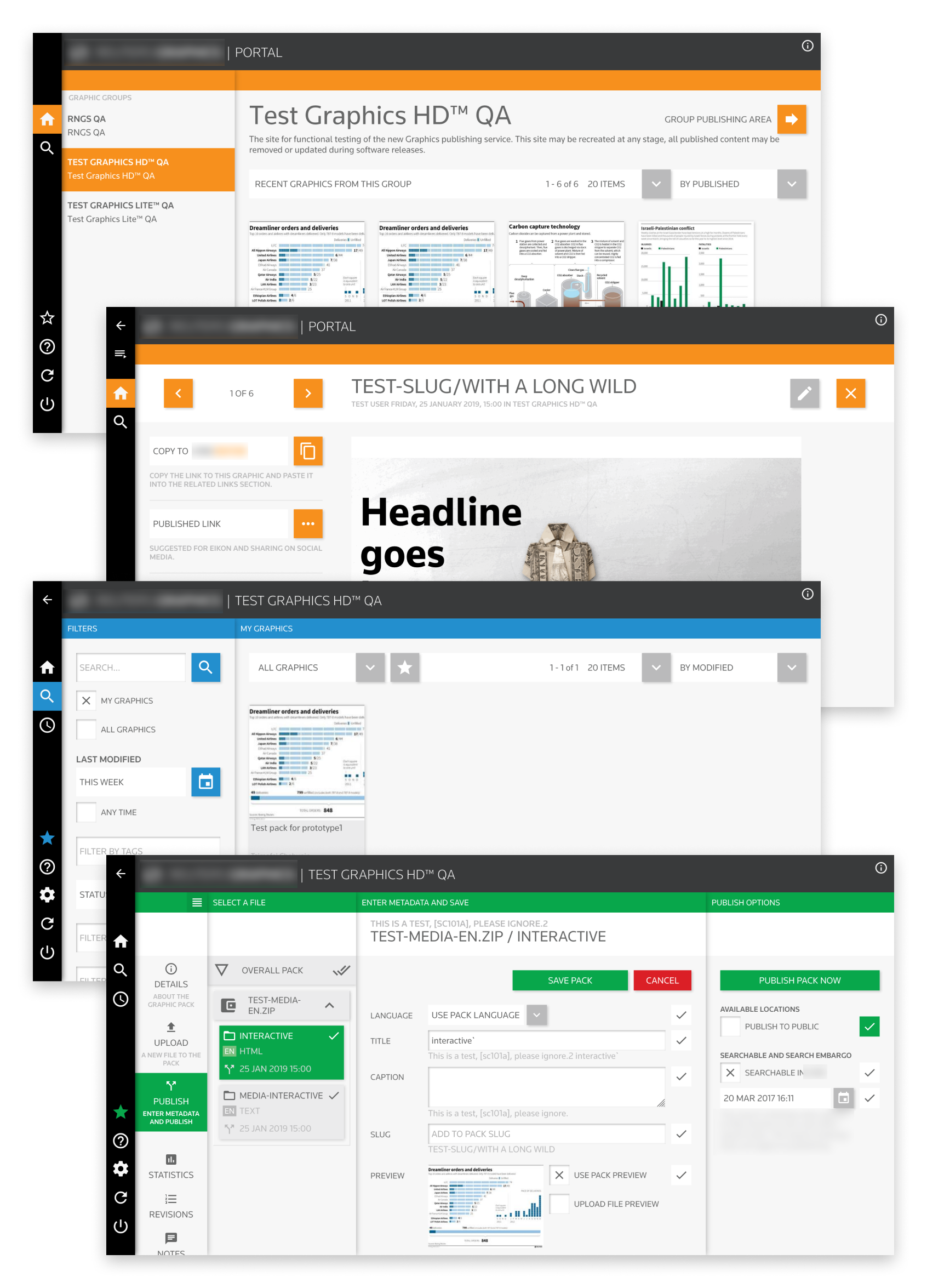
Using heuristic evaluation and guerrilla usability testing techniques, I managed to evaluate the old UI as well as offer and implement local UI changes that improve overall user experience as well. Working in close collaboration with the client, I made sure that none of these redesign features would not confuse or mislead current users of the system, — every change has been discussed with the product owner before implementing it.
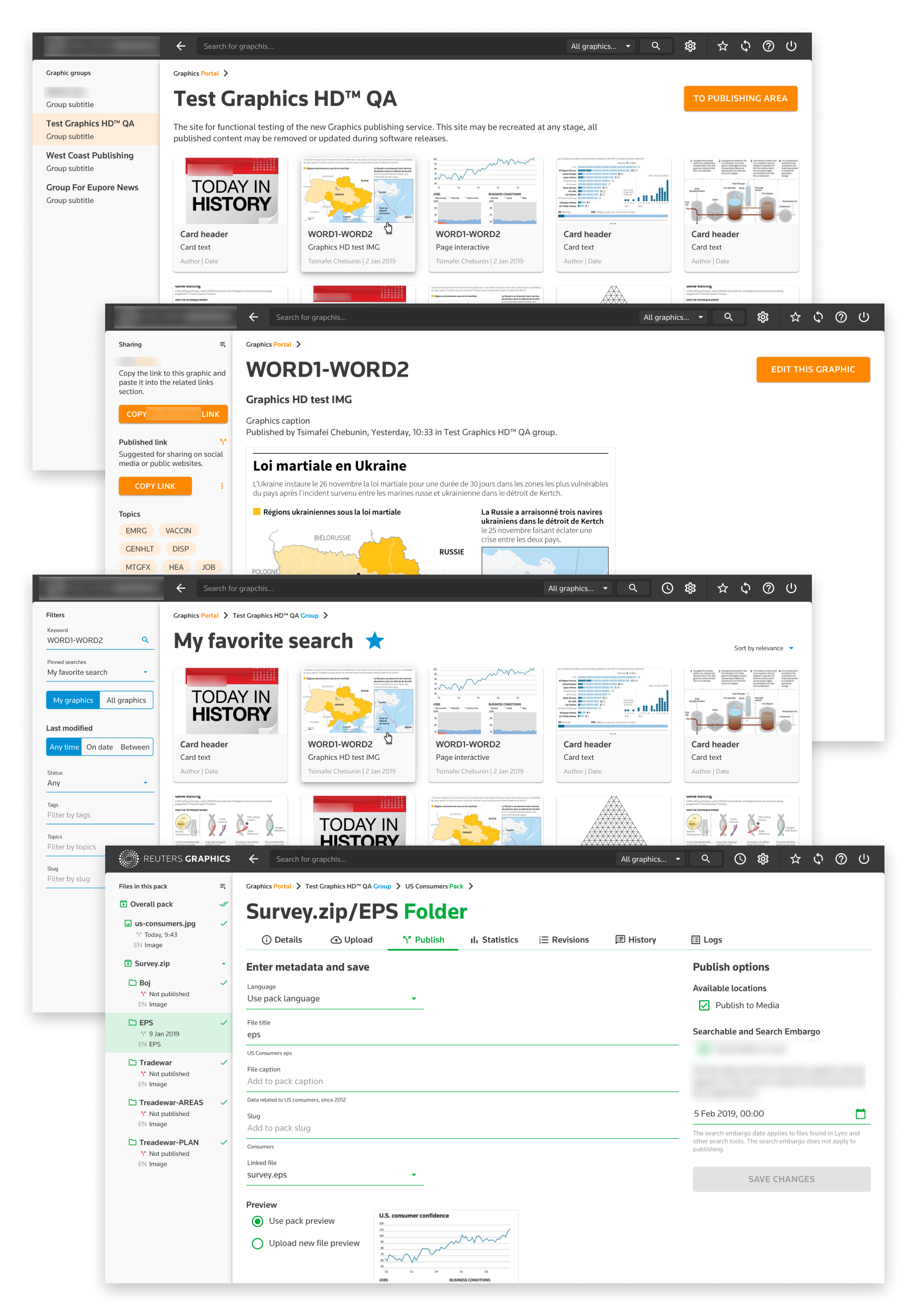
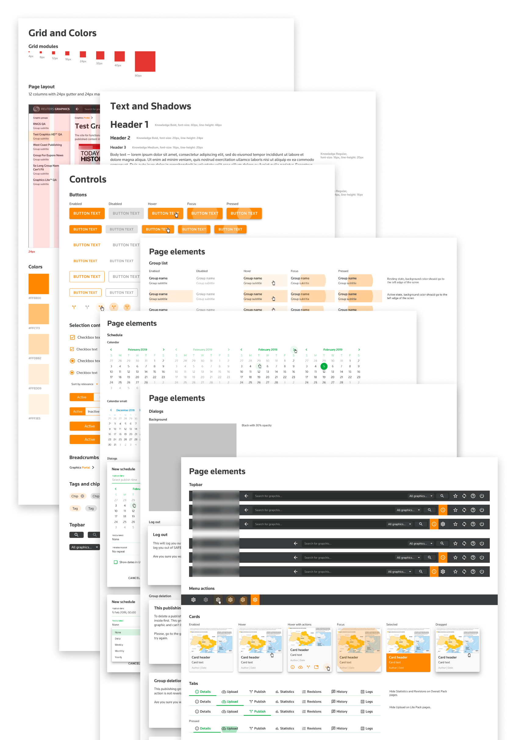
By following component-based approach for this project, I've created a custom UI library. The library was created within the limitations of the available front-end libraries to meet tight deadlines and reduce development cost. In that way the development team could implement the UI and build new screens with little to none modifications of components available.
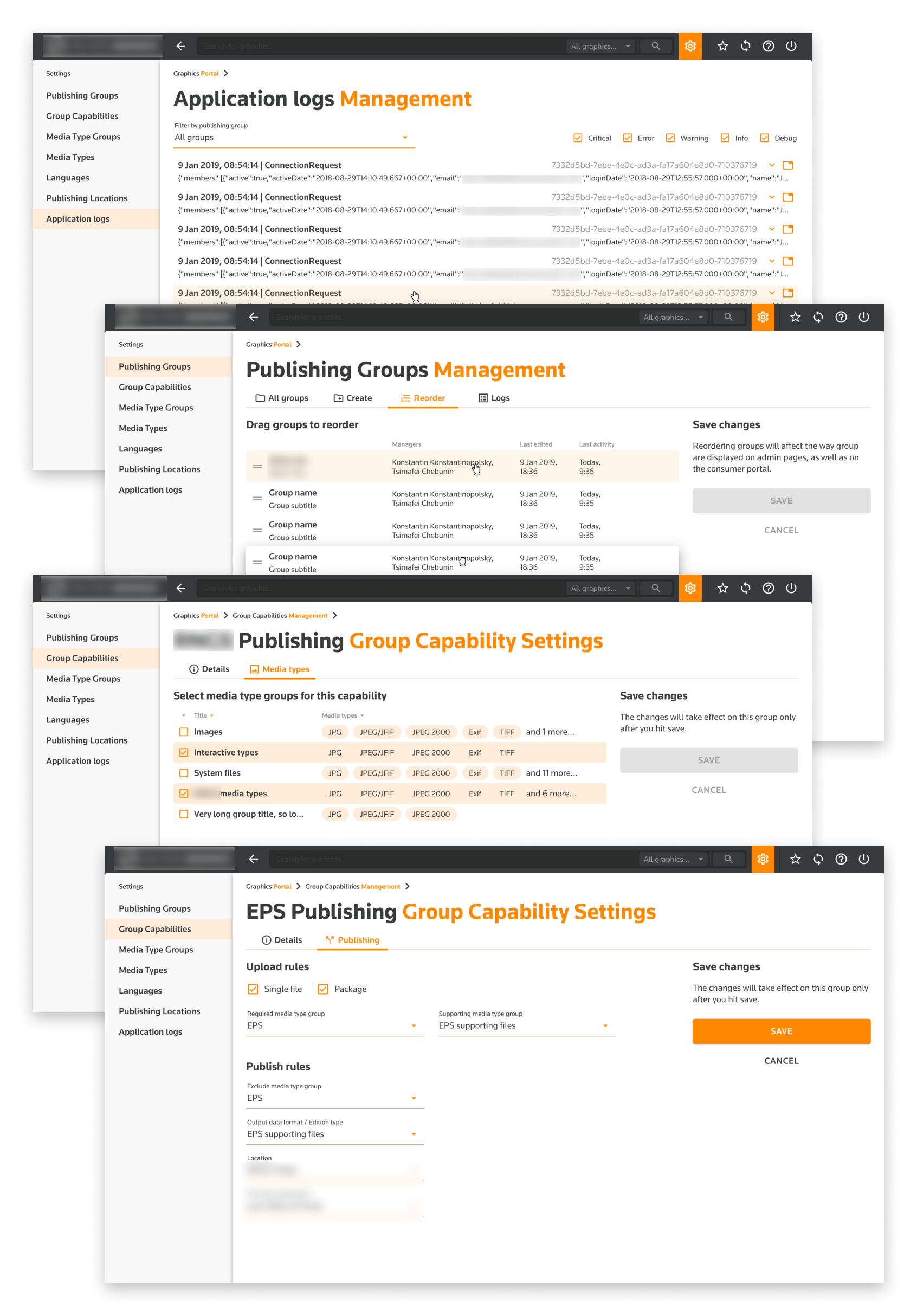
Later on the design stage of the project, I also designed and implemented a completely new module of the system. This module was created using the same UI library, so it automatically aligned with the rest of the portal, providing consistent UX for all user roles without additional development costs.
Results
The redesign was completed in less that two months, meeting all the deadlines, and staying within budget. At the same time, the EPAM team exceed the client's expectations: we did refreshed the look and feel, but in a way that improved overall user experience as well. This resulted in a long-lasting partnership and a great customer testimonial:
During the UX sessions led by Tim, we reviewed each screen in detail and discussed and agreed any required changes, which were swiftly implemented. There were many occasions where we had to create completely new screens, for functionality that does not exist in the current live system. This is where Tim was fantastic. As we discussed a particular workflow or problem, Tim was able to think of solutions on the fly, agree what we wanted and then get on with building the UX/UI around this. This then allowed the team to review and again fine tune/approve.
We went through several iterations based on things that would come up as we developed more of the UI. Tim always remained positive and was ready to make changes to work that we previously thought was complete.
I personally thoroughly enjoyed working with Tim and would not hesitate to have him support any of my projects. After the completion of Tim’s work, I tried to have him allocated to other our projects. This didn’t unfortunately (for us) happen, due to Tim being snapped up on another EPAM project. Me trying to get Tim allocated to other projects is testament to his approach and all round work ethic. I’ll end by saying that Tim is a strong individual contributor and a great addition to any team looking to turn a vision into reality — from the initial wireframing to end-to-end clickable prototypes with a universal style guide covering all aspects the defined scope.

Dipak
Senior Product Manager